Blog
Don’t Let Amazon Eat Your Lunch
We can’t force shoppers but we can certainly gently nudge them.
If a visitor to your site leaves for your Amazon page you are basically paying an affiliate tax that was yours to keep.
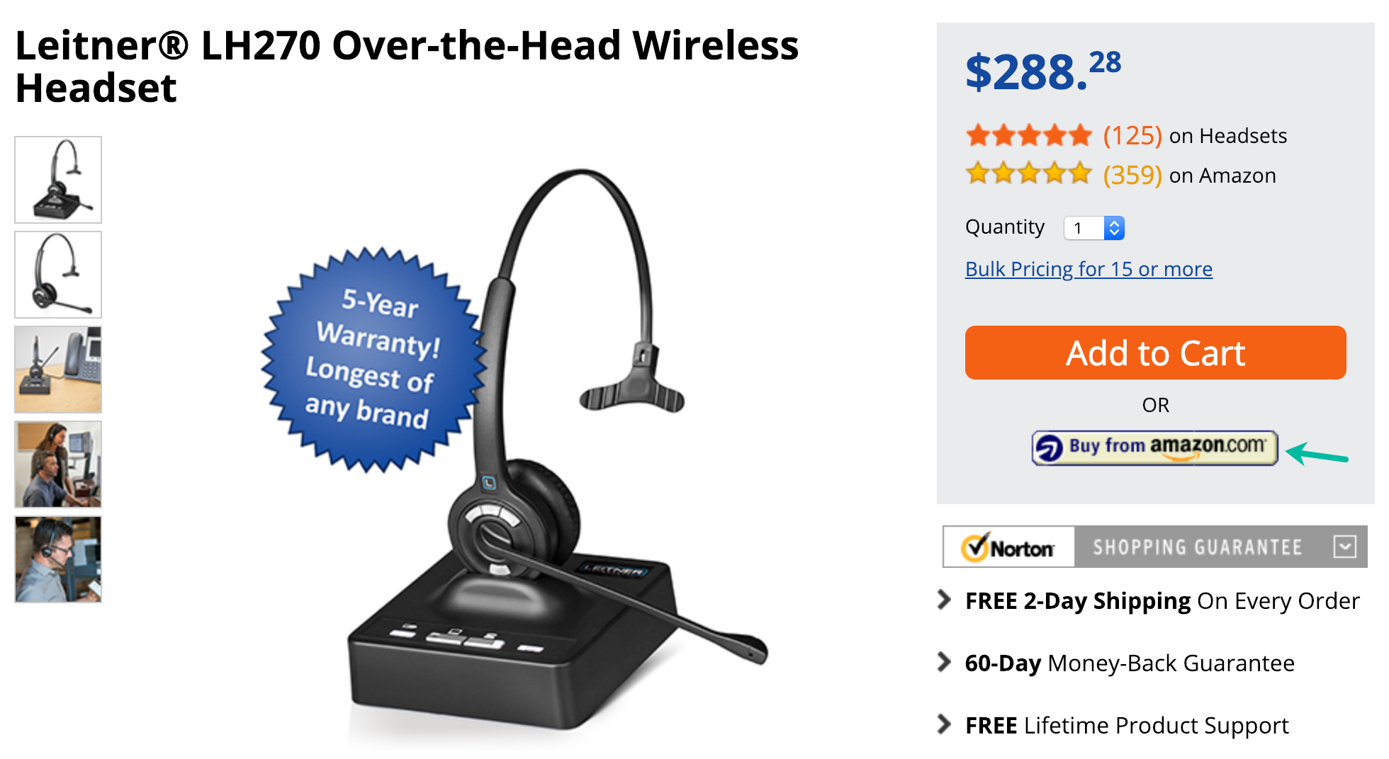
Can this be prevented? Let’s look at a product page on Headsets.com:

They have an impossible to miss Buy from Amazon.com button. On click, you are taken to their Amazon page. Goodbye margins.
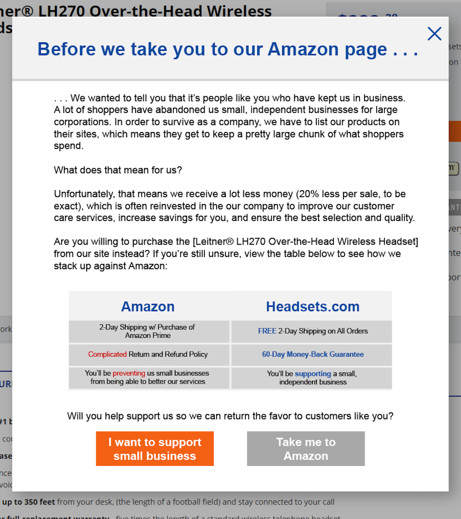
Here is what we would have done if headsets.com was a client. When a shopper clicks Buy from Amazon.com we’ll show this popup:


Comments 2
Love it! Another alternative is to offer to let the customer use Amazon Pay, which lets customers use all their data already stored on Amazon (address, cc details, etc) for super-fast checkout. This way the customer get the “trust-factor” that they associate with Amazon, and you only pay Amazon the tiny fees you would otherwise pay to your credit card processor.
One other comment on the pop-up: As all the data points regarding Amazon are on the left and all the data points regarding the small retailer are on the right, I would switch the sides of the Buy buttons as well.
ReplyFrictionless Commerce
Ted: As all the data points regarding Amazon are on the left and all the data points regarding the small retailer are on the right, I would switch the sides of the Buy buttons as well.
Rishi: I like this suggestion but want to be 100% sure. Could you explain your reasoning? Is it because people read left to right?
BTW, wish you a wonderful 2019 🙂
Reply