
Blog
Difficult Choices Kill Conversion Rates
We think choices are good, but if you don’t clearly describe the differences between choices you are most definitely hurting conversion rates. Consider this: A shopper is looking to buy a wireless temperature sensor for their grill. They land on https://store.weber.com/accessories/category/igrill-products/1640 product page:
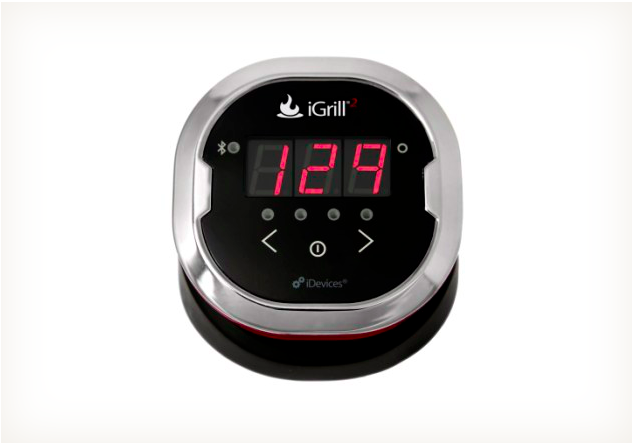
The item sounds impressive and within their price range. But now the shopper notices a second option called iGrill® mini and it’s priced lower:
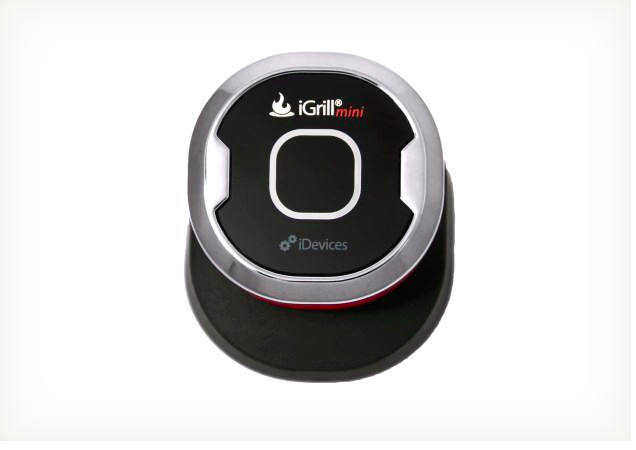
The shopper is viewing this page on their mobile phone (small screen) and they’re switching back and forth between the 2 options to understand why the mini is cheaper. They like the lower price but a voice in their head says, “what’s the catch here?”
And unless they clearly understand why the mini is cheaper they aren’t going to buy.
It turns out that the difference between the 2 models are the number of probes you get. But in the 10 minutes I was playing on these 2 product pages I simply couldn’t figure it out.
I’m not the sharpest knife in the drawer, but neither are many of your potential customers. You aren’t designing experiences for the smartest shoppers, you’re designing them for average, easily distracted shoppers.
Here is an idea: add a piece of code so that if a shopper first visits iGRILL® 2 page and then goes to iGrill® mini, on mini page we add new bolded content under product description that says:
The difference between iGRILL® 2 and iGrill® mini is that with iGrill® mini you get just 1 probe slot and with iGRILL® 2 you get 2 probe slots.
This would make my choice clear.


