Blog
Customized Product Comparison Table
There is one really important aspect of improved conversions: when you let the user drive their own experience they convert at a higher rate.
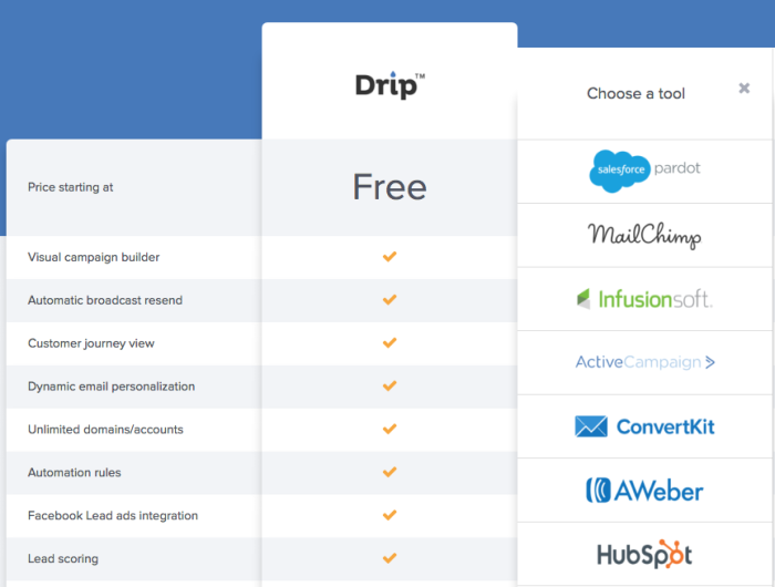
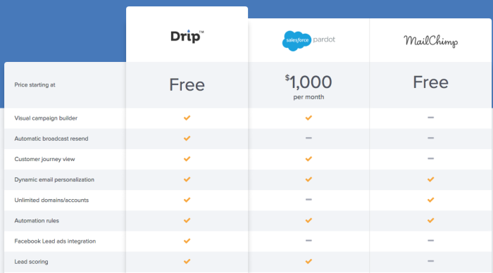
Drip.com understands this. When you go to their comparison page instead of showing a table with 3 pre-selected competitors Drip allows users to select the competitors they want to compare Drip against, thus improving the relevancy of the comparison.
This is how the page looks when you first get to it (https://www.drip.com/comparison):

And this is what I see after I add my 2 selections (Pardot and MailChimp):


