
Blog
What Makes Your Product Better Than Your Competitors?
Honey Stinger is a company that provides “great tasting, honey-focused energy foods made with wholesome ingredients.” They offer products like organic waffles, organic energy chews, bars, energy gels, and so on. Their site does a great job of explaining their products, why they work, and who they’re for.
The Problem & Why It Matters
Despite the fact that Honey Stinger explains their products well, we don’t believe they’re answering one important question: “Why should I buy your energy products and not a typical energy drink or bar?”
The food and beverage industry is full of energy drinks and energy foods. This means Honey Stinger has many competitors for their traffic to turn to if they’re not immediately convinced that Honey Stinger is the best option for them.
In short, answering the above question directly can be the difference between a new shopper clicking that Add to Cart button or leaving the site entirely to go pick up a Red Bull.
How Messaging Solves the Problem for New Buyers
Here’s our hypothesis: if we include messaging that addresses the above question on all product pages, then we can increase the purchase intent of shoppers and drive more traffic to the cart page.
So what did we do?
Let’s take a look at one of Honey Stinger’s product pages:
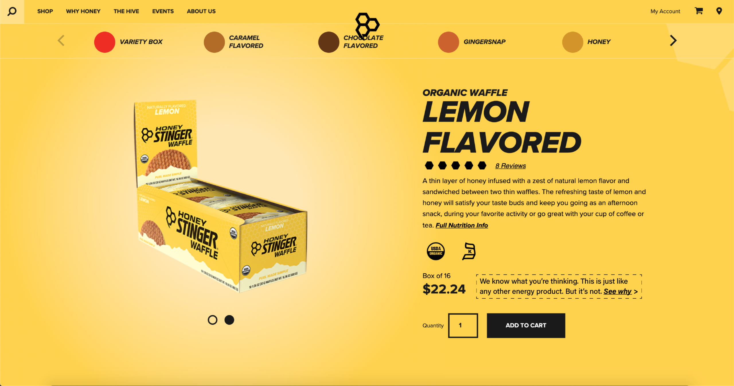
Above the Add to Cart button and beside the product price, we added the following copy:
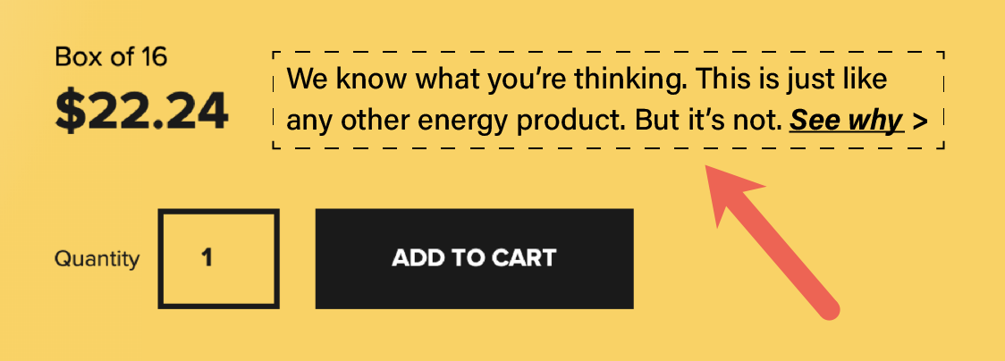
We know this is a question new visitors to this page might have. Based on our previous testing, this will likely result in a respectable click-through rate on our call to action.
Once shoppers click on See Why >, they will see this modal (popup):
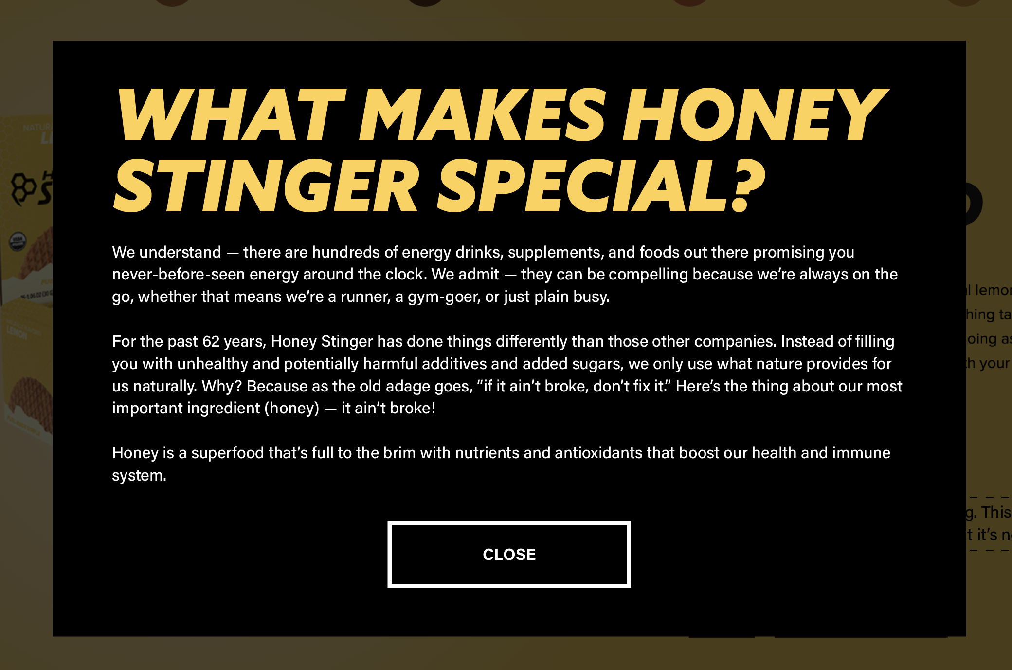
Here’s the copy from the above modal:
WHAT MAKES HONEY STRINGER SPECIAL?
We understand — there are hundreds of energy drinks, supplements, and foods out there promising you never-before-seen energy around the clock. We admit — they can be compelling because we’re always on the go, whether that means we’re a runner, a gym-goer, or just plain busy.
For the past 62 years, Honey Stinger has done things differently than those other companies. Instead of filling you with unhealthy and potentially harmful additives and added sugars, we only use what nature provides for us naturally. Why? Because as the old adage goes, “if it ain’t broke, don’t fix it.” Here’s the thing about our most important ingredient (honey) — it ain’t broke!
Honey is a superfood that’s full to the brim with nutrients and antioxidants that boost our health and immune system.
In this lightbox window, we tell shoppers we understand their skepticism. Then we explain to shoppers that other companies are using unhealthy additives in their products while Honey Stinger only uses natural ingredients.
In other words, we’re directly answering the question: “Why should I buy your energy products and not a typical energy drink or bar?”
We’re confident this type of messaging will drive more traffic to the cart page and drive more transactions.
Price Justification
The copy in the modal was constructed using our Price Justification sales pitch construction process. In the example, we’ve shown one version but there are other angles you may want to explore for your brand. To learn more about Price Justification head over here: Increase Conversions With Price Justification.
Why We Picked This Location to Insert This Message
We placed our call to action above the Add to Cart button and beside the price because shoppers will naturally move their eyes to this location to see what the price is. This will help increase the number of clicks on our call to action, which in turn will increase the number of eyes on our messaging.
Art of the Start
If you operate in a highly competitive space you need to master the art of the start strategy. Here’s why: if you are in a competitive space that means shoppers are aware of multiple other alternatives, which means they spend less time per site visit, which means we have a narrow window in which we need to connect with the shopper. If this is your scenario you need to read this article: The Art of The Start.
Revealing It All
We hope you liked this article. We have so much more to share with you.
Why Listen to Us?
We’ve spent the last 16 years in our marketing lab 🧑🔬 🧪, experimenting on online shoppers. We’ve learned a crap ton and are ready to share those learning.
We want more marketers and CEOs to know about it.
Eventually, we’ll make this into a book. If you want an unfair advantage over competitors now is the time to steal our ideas because once they are published the cat will be out of the bag.
Each chapter in our forthcoming book will feed into the next. Click the link that best describes where you want to start the story:
Chapter 1: is all about conversation rate optimization (CRO). It talks about the history of CRO, statistics of CRO, and describes how most agencies do CRO. We need to describe how most are doing it before revealing our process (that’s the topic of Chapter 4.)
Chapter 2: For every 1,000 product pitches encountered the shopper buys 1️⃣ item (and we’re being generous). If the goal is to have the consumer choose your product we need to understand their selection criteria– we need to understand their buyer psychology. Marketers who nail this will always outrun their peers.
Chapter 3: Conversion optimization work typically focuses on design and layout changes. We don’t limit ourselves to design and layout. Through extensive experimentation, we realized that the thing that moves the conversion needle 🧭 are the words and ideas expressed on the page. Conversion copywriting is where it’s at.
Chapter 4: Marketers make a fatal mistake. They focus on optimizing the whole site. We focus on the tip of the spear. The most important page on your entire site is your product page. To understand why this is, read this post: Product Page Optimization.


Comments 6
I like this hypothesis, Rishi. Furthermore, I think one needs a strong value proposition.
It has 6 components to be checked off–
1. What the product is
2. What the product looks like
3. What the product does
4. How you can use the product
5. How does the product compare
6. How you benefit from having it
Ensuring all of these being answered on a product page will do it a world of good!
ReplyRishi Rawat
Thanks, Sumantha. And, per your suggestion (great suggestion), I also linked this post to the honeystinger.com site. Who knows, they might end up noticing our post 🙂
ReplyVery good idea to handle customer objections without being very intrusive or sending off the page or website to deeper pages to find this information to only get distracted and not return or complete their purchase.
ReplyRishi Rawat
You’re exactly right, David. Thanks for commenting. –Rishi
ReplyRishi, is it possible that the placement is actually adding more friction to the buyer journey? What’s been your experience testing this type or placement?
ReplyRishi Rawat
We find placing an assurance message near the price point not only gets attention, but it also has a big influence on purchase intent.
When the shopper is looking at the price is when they’re making a mental calculation for if they should buy or not buy. It’s a good location to reassure them.
Oh, by the way, Happy New Year to you Shilo!
Reply