Blog
Coach Needs Training
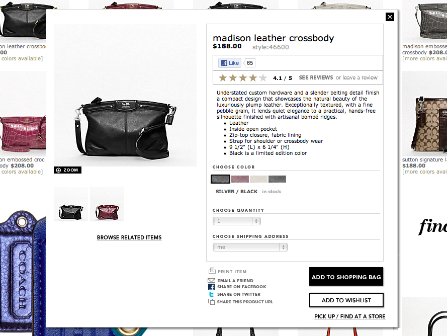
On coach.com clicking a product image on category page displays product details in a 50% size pop-up window–

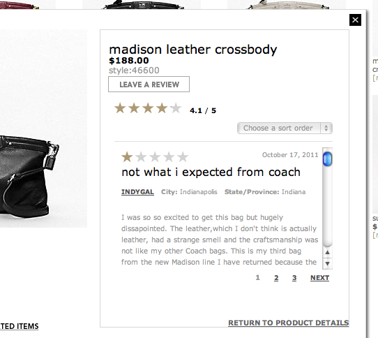
It would be nice if this pop-up was optional and visitors who wanted to see a full product page could do so. But coach.com only shows the pop-up. Here’s the problem– if the product pop-up is compressed 50% then customer reviews are even more compressed–

Which requires a lot of scrolling to read 5 reviews. Plus, the font color is so incredibly light.


