Blog
Cleverest Email Signup
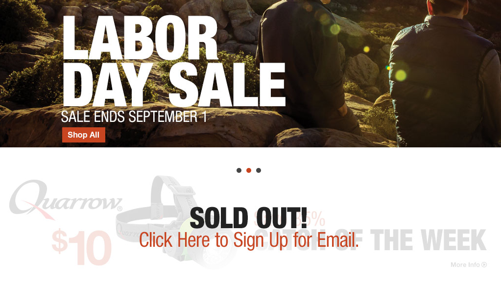
I felt I had seen every tactic possible to goose email signups (example, example, and example). Then I saw this clever tactic on basspro.com. Below their main advertisement banner they have a giant SOLD OUT! sign for a $10 catch of the week item—

A naive person would think it’s silly to waste so much homepage real-estate promoting an item shoppers can’t even buy (it’s sold out). But basspro.com isn’t naive, they understand human psychology and know shoppers hate the idea of missing out of something (even if they weren’t really interested in this particular item). Basspro.com isn’t advertising a sold-out item, they’re advertising a solution for shoppers who never want to feel like they’ve missed out on a deal. That’s what they’re using this vital homepage real-estate for.


