Blog
Clever Way to Capture Email
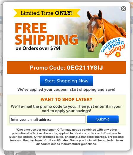
On horse.com this popup appears on landing pages—

Couple observations—
1: Well designed. Design matters.
2: Creates sense of urgency via Limited Time ONLY! banner. Could be more effective if they showed dynamic date. Example— Offer Ends [current date + 4].
3: They use a non-generic promo code (0EC211Y8IJ). This is an important detail because when shoppers see generic coupon codes they tend to assume they’re freely distributed, a promo code like 0EC211Y8IJ looks special.
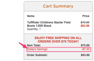
4: “We’ve applied your coupon, start shopping and save!”— clever. The shopper doesn’t have to worry about manually entering coupon code since it’s been applied preemptively. I did notice that on their cart page they show the discount …

… but don’t clarify that this discount is the automatically applied discount. I’d clarify that through simple messaging tweak.
5: WANT TO SHOP LATER?— this is a super important detail. Many people who are seeing this popup might not be ready to use the coupon code today. Offering the convenience of emailing that coupon code to the shopper is a win-win for both parties.


