Blog
Clever Discount Tactic for 2019 (that None of Your Competitors Know About)
10% discounts are everywhere. They are so pervasive most shoppers ignore them or yawn when they see them. Here is a discount offer on seabags.com:
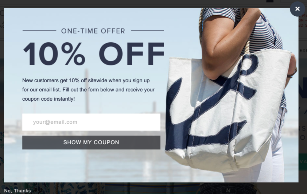
So if shoppers are unimpressed by a 10% offer, what is seabags.com to do? One idea is to give a bigger discount. That’s actually a terrible idea.
We have a better idea. What if we flipped the script?
While studying the site I noticed they have some really cool, eclectic pieces. From a Blue Lobster Print Ditty Bag . . .
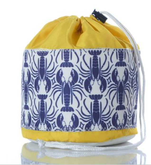
. . . to this coaster:
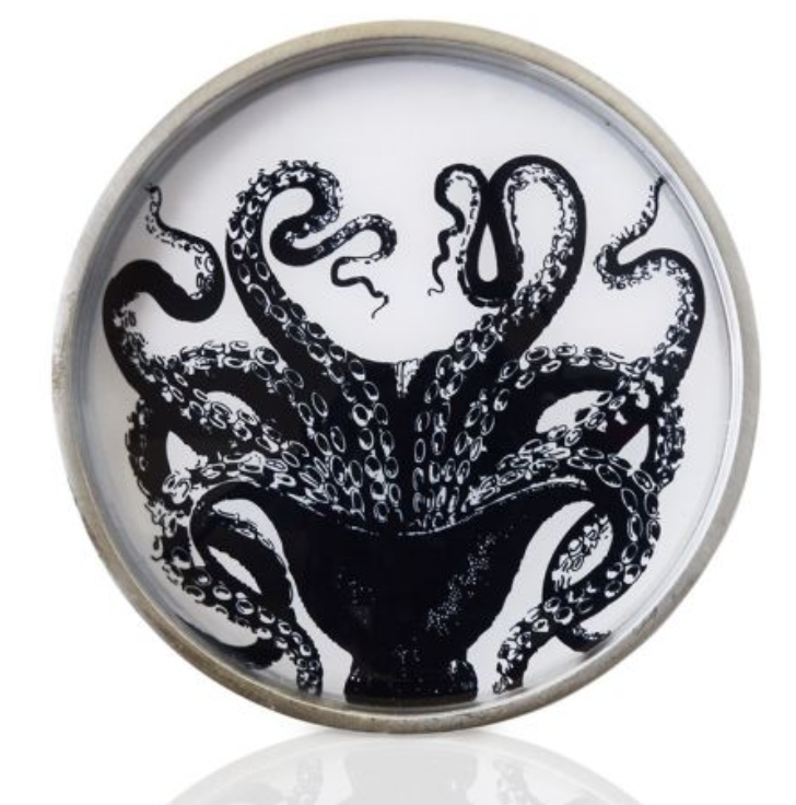
The unifying theme is that everything is nautical.
Without even looking at their data (and based on data we’ve seen for many dozens of other sites) we know two things about user behavior:
1: When users are on your site they don’t notice 83% of what’s on the site. So most of your good stuff remains hidden.
2: There is an undeniable relationship between how much time a user spends on your site, the number of pages a user sees, and overall conversion rates. If you can get a user to spend 20% more time on your site, their conversion probability will go up. This is a fact.
So our big insight was: seabags.com has a lot of cool stuff and most new visitors will never stumble on those pages. If we could somehow get those users to stay a little longer and leisurely stroll the site (like a walk on the beach), they would notice something they simply “have to have.”
So we removed the upfront 10% off discount. Here is our concept:
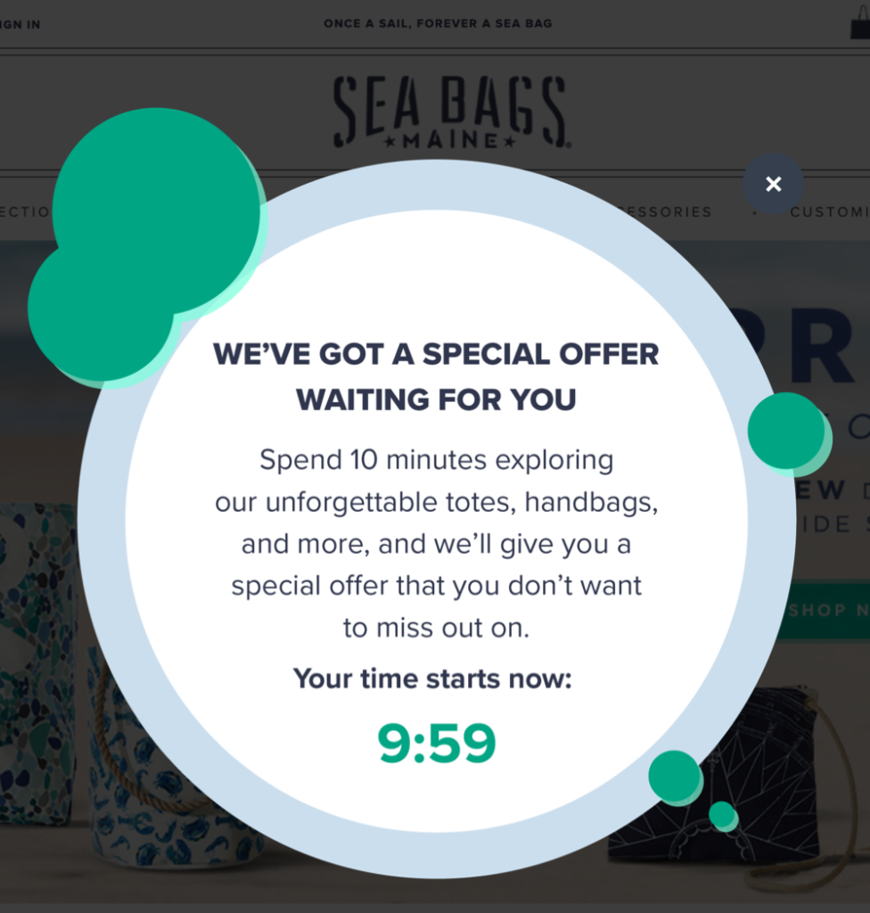
The big difference is that now the user is presented a treasure hunt first and AFTER the 10-minute marker the 10% discount is revealed.
Do you think this strategy can be applied to your site? This strategy works best for sites where there is an element of discovery. Where the user doesn’t know exactly what they’re looking for but will know it when they see it.



Comments 6
Hi Rishi – thank you – I love the idea of a treasure hunt and also love finding a way to get customers to spend more time on the site as a way to increase conversion rates. Thank you, both great ideas.
ReplyRishi Rawat
So glad you liked the idea 🙂
ReplyAnother genius insight. You incentivize the customer to spend a longer time on the site, and then you give them a reward that they don’t know about. Rishi everything you post is absolute gold!
ReplyRishi Rawat
Thanks, Jonaed 🙂
ReplyI like that. That’s powerful. Do you think a “free gift” would be more powerful? Because “special offer” sounds like it’s going to be a discount to me 😜
Great, great article by the way. Thank you for sharing my friend!
ReplyRishi Rawat
Hey, Tommy. The special offer is the 10% discount we give at the end of the 10-minute treasure hunt. The only difference is that in our campaign we’re making shoppers work to earn their discount.
Reply