Blog
Category Page Idea
There are things we want to tell our shoppers (like how our product is the best, or our easy return policy, or the fact that we only carry organic food items). But it’s hard to know when to interrupt the shopper experience to show this message.
— Should we show it moment they land? Wouldn’t that be too in the face?
— Should we be patient and show it once the user is engaged with the site? How do we define engagement?
— Should we show it during checkout?
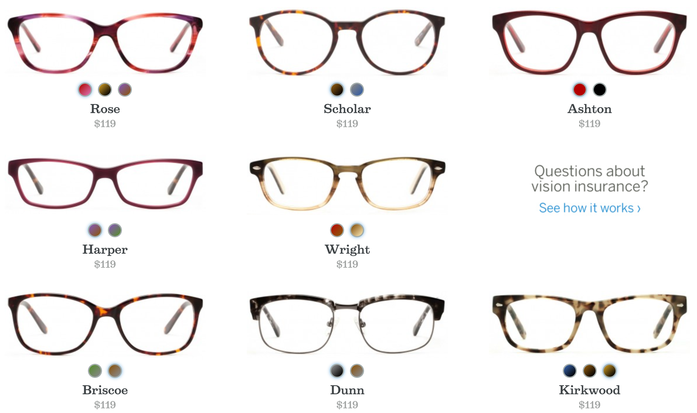
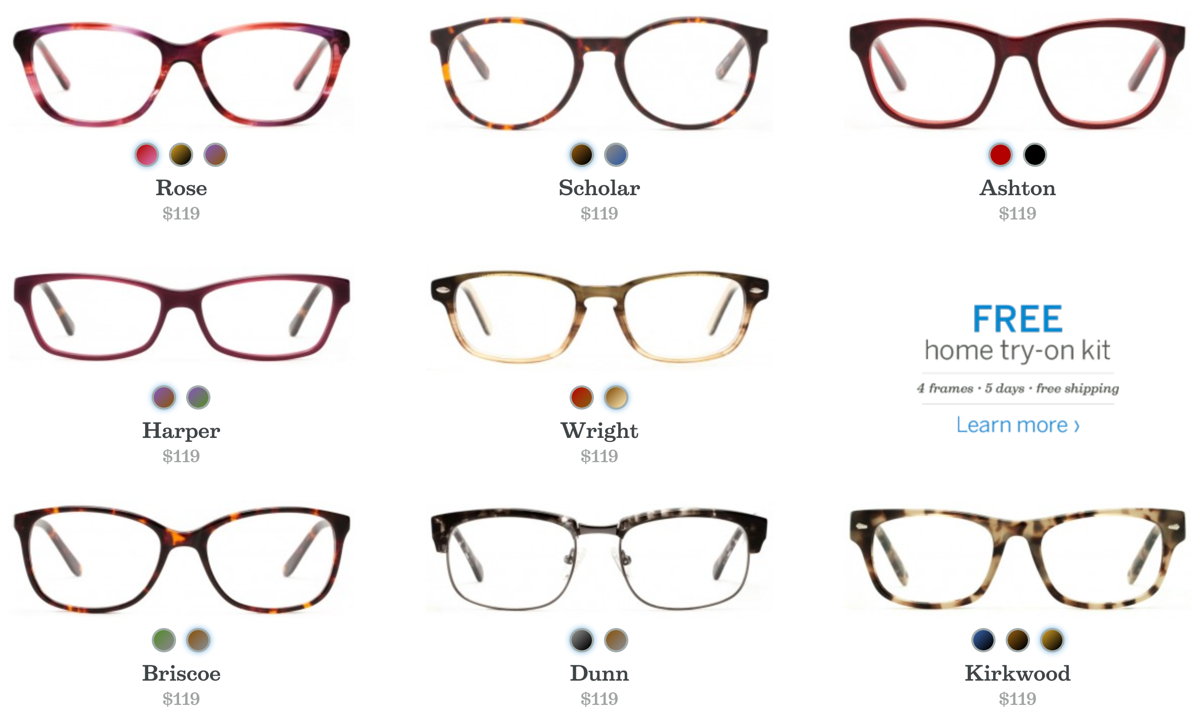
Felixandiris.com has identified a clever was to solve this. They want to let users know they can try their frames at home for free. Once you get to their category listing page and scan the frame options one of the tiles that would normally be saved for a product image has been used to show their sales message. This is great for a few reasons:
— Users on category pages are trained to visually inspect each listing because this is how they decide which product page they’ll want to ultimately visit.
— Because the user was expecting to see a frame design on that tile location not seeing it catches their attention:
If you really want to be smart you could craft a Choreographed Experience around this. The rule would be: If, in this session, the user has already interacted with our free home try-on kit message then use this location to show our Questions about vision insurance? message. This both helps conserve the use of marketing real estate and prevents the user from seeing a message they have already interacted with (free home try-on kit).
Users who have already interacted with free home try-on kit message (anywhere on the site) will now see this: