Blog
Case Study: Make Them See Your Point of View
As online retailers we want our site visitors to behave a certain way. Our visitors have their own ideas about what they want to do. E-tailers who figure out a way to get what they want are the most profitable.
Misterart.com sells art supplies. Most art supply items are fairly inexpensive (averaging $5-$10) so one-time purchases aren’t in the interest of misterart.com. Art supplies are purchased by artists, and art is a lifestyle so if MisterArt can get a shopper to buy from them exclusively they’ll generate a nice profit over the lifetime of that relationship. This is why they created a VIP Program that gives shoppers a small discount on each purchase. The VIP Program costs $25 a year. MisterArt wants shoppers to purchase this. Shoppers might not feel as enthusiastic, so MisterArt has a clever tactic. At every turn, they remind shoppers how much they could save if only they were VIP program members. In itself, individual reminders aren’t persuasive enough to generate signup but each instance nudges the shopper just a little. Hopefully, by nudge number 4 the shopper will just give in.
Nudge 1 happens at the homepage—

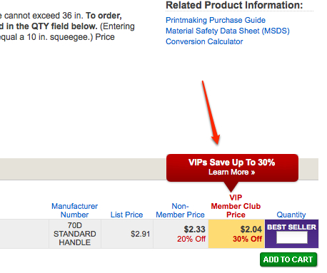
Nudge 2 happens on product page—

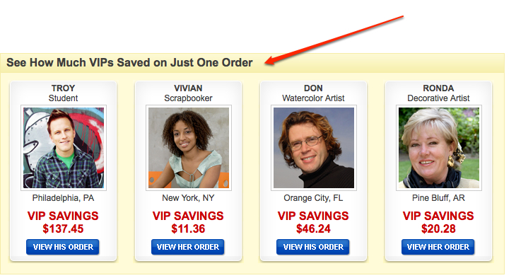
At this point the shopper at least wants to see how they could save 30%. So they click the Learn More link and are transported to sales pitch page. Here they’re told about the $25/year fee along with nudge 3—

This nudge is a poor one because they are listing how much these shoppers saved in one order. Since the VIP program has an annual fee it would have been more effective to showcase how much VIP members are saving annually. Anyway, that’s a minor detail. Overall, their sales pitch page is quite good. I’d recommend reading it fully— https://www.misterart.com/vip.html
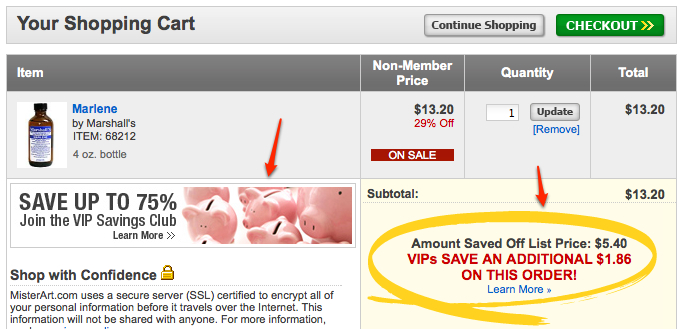
Now, if some fool is still not convinced they’re hit with nudge 4 on cart page—

If you liked this post you will also like my Novica.com case study.


Comments 2
Awesome strategy. But I would disagree with your observation “This nudge is a poor one because they are listing how much these shoppers saved in one order”. They are consistent with their messaging. They want to show immediate savings to the visitor.
Replybetterretail
I’ll respectfully disagree. I would have highlighted annual savings. I would also update sitewide messaging to talk about annual savings.
Reply