Blog
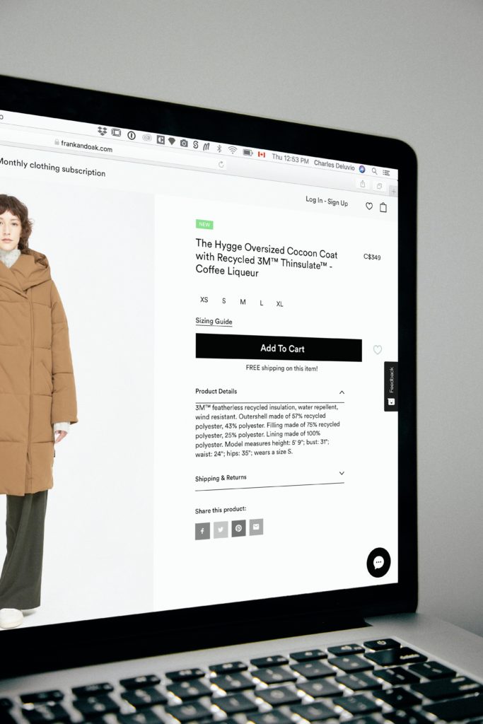
Most Important Page on an eCommerce Site Is …
… the product page.
This article isn’t about “18 of the Best Product Page Design Examples” or “18 Ecommerce Product Page Best Practices” it’s about one simple idea:
How to think about your ecommerce product page to make more $$.
Whether your site’s conversion rate is 1% of 8% (on the high end) the fact is that you can improve your landing page as you want and it will have very little impact on your overall conversion rate, which is the only number ecommerce business owners should care about (everything else is a vanity metric).
However, if you improve product page conversion rates for product page A by 10% it’ll have a 10% lift in sales of product page A. Now, that’s a big deal.
So let’s think about our wonderful eCommerce product page.

So the product page really matters. This much is clear. But here’s the thing that really bothers me: I’ve studied over 900 ecommerce sites in the last 12 years (a little about me) and no matter how big the retailer is their product page is always static.
I mean, no matter who I am and how I get to their product page the sales pitch on the product page is always the same. But should it be? You’ll see below the answer is no.
Possible paths to an eCommerce product page:
- Someone might reach product page B via a “you may also like…” link on product page A. This visitor doesn’t have any context about product B. They just got here because your marketing brought them here. For this visitor give a detailed product category back story. They’re intrigued but have no context.
- Someone might reach product page B via a long-tail organic search term like “golf smartwatch with GPS tracker and course map“. This visitor knows what she wants. Give her the technical details and get out of the way.
- If someone Googles “Garmin golf watch” they’re telling us 2 things: A, they trust Garmin. And B, they don’t have a specific model in mind. These people are looking to Garmin to make that recommendation. Be that trusted advisor.
- Someone might revisit your product page via your retargeting ad (what is retargeting?). This person has already seen your story. They didn’t buy the first time because something was missing. Should we repeat the story a second time? Or should we try and address unanswered questions from the first visit? I vote for the latter.
- Someone might be visiting your product page a 3rd time in 20 days (on their own, not via retargeting). Clearly, this shopper is itching to pull the trigger but something is holding them back. What if you slightly tweaked the product description (added more confidence) to give that extra push? Buyers feed off the confidence of sellers.
As you can see each of these visitors is totally different. Yet, we show them the same e-commerce product page content. Let’s give them a more personalized story.
Other buyer psychology-based eCommerce conversion ideas
If you liked this idea to boost eCommerce sales on your product page you are bound to also love these ideas:
“Is My Marketing Working?” A Unique Product Page Design Idea
Product Reviews & Buyer Psychology


