Blog
Product Discovery: Are Your Best Product Pages Getting the Most Traffic?
They should be. But almost never are.
This is a phenomenon we see all the time. When looking at Google Analytics, we’ll often see that item X is driving 12% of a client’s overall sales. That’s pretty impressive. However, we then look at the traffic that reaches item X’s product page and realize only 5% of visitors see it.
That’s a problem because your bestseller (the workhorse) should be getting the limelight. However, this is also a huge opportunity for increasing sales.
If your visitors aren’t naturally gravitating to your best seller, then bring the best seller to them.
Let’s look at an example. Wetakethecake.com (not a client) became super famous a few years ago because its Key Lime Bundt Cake was picked as one of Oprah Winfrey’s “Favorite Things. ” When we visited the Key Lime Bundt Cake product page on Wetakethecake.com and compared the number of reviews to the number of reviews of the rest of their product line, it was clear that this product was the best seller… by far.
If Wetakethecake.com would hire us as their conversion optimization agency, then this is what we’d A/B test:
1. We Would Add a Floating Tab to the Site
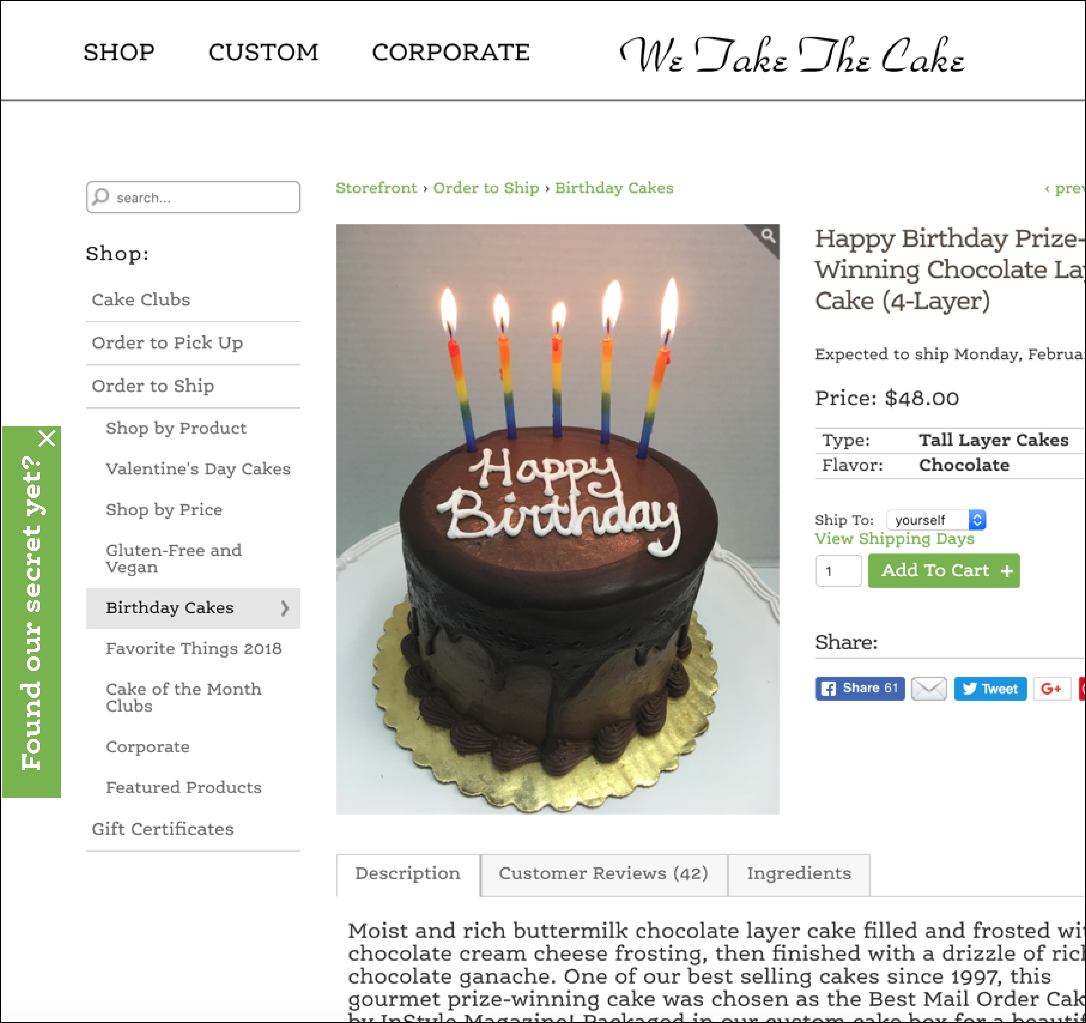
With our test, our goal is to increase traffic to the Key Lime Bundt Cake product page through a floating tab (notice the “Found our secret yet?” tab below):

A couple of important design choices have been made: 1) Shoppers hate random floating or popup elements, so we’ve offered a way to close the tab (notice the ‘close’ button in the upper right corner), 2) We’ve intentionally phrased the copy in the tab to be a little mysterious. In testing, we find phrasing things as a question drives significantly higher click-through rates.
2. We Would Make the Tab Open a Slide-out Window on Click
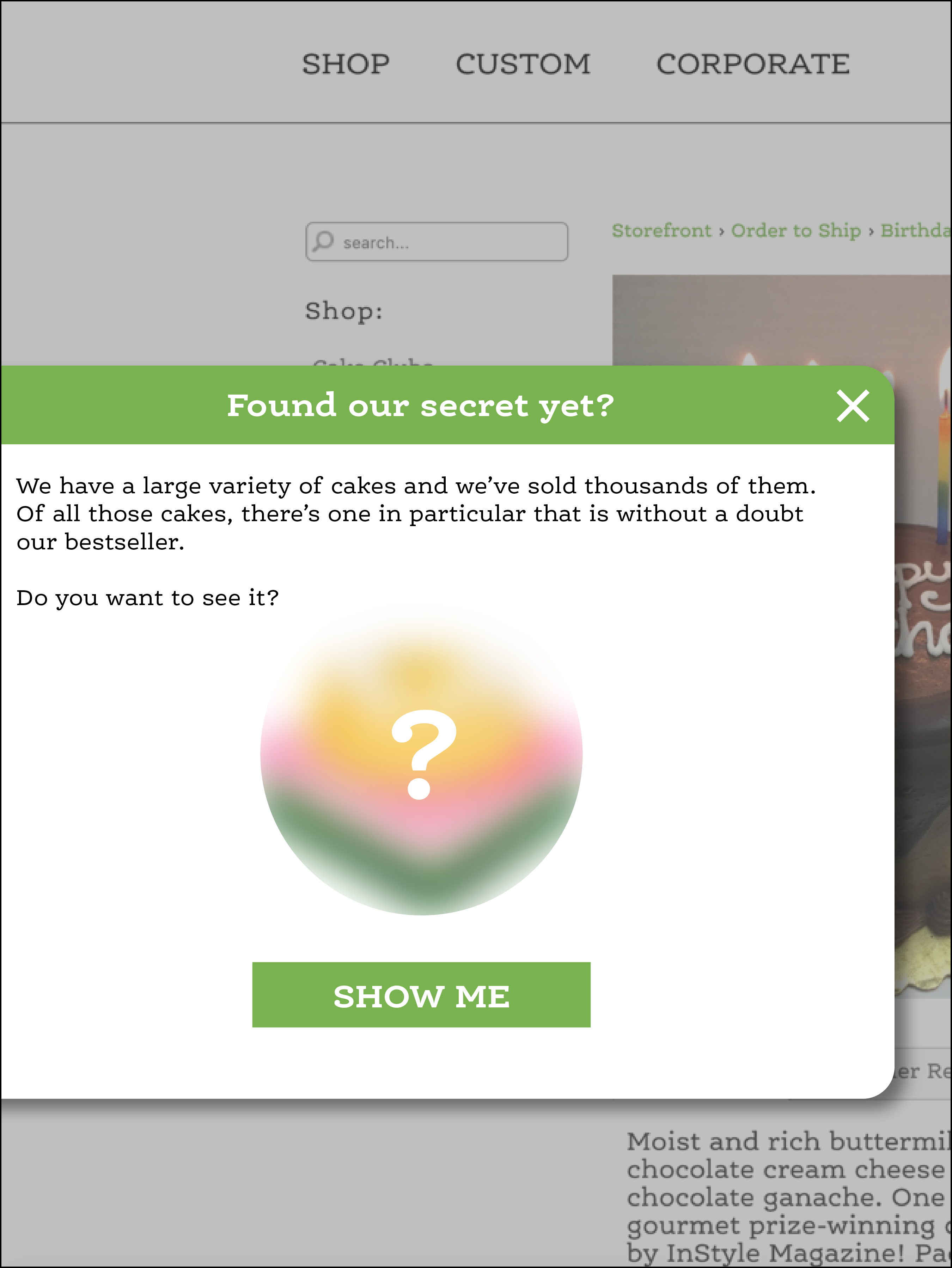
When someone interacts with the tab, we’ll open it for more context. See below:

This does 2 things:
1) It’s fun.
2) It makes sure that the bestseller that’s driving 12% of sales is also seen by 12% of traffic.
Warning: No idea can be applied directly without thought. I can list dozens of ways in which directly implementing this idea without considering your business strategy and site user experience can annoy users. What we are showing here is a mechanism for making best sellers more visible. You still need to do the hard work of designing this so it works for your site.
Revealing It All
We hope you liked this article, but there’s so much more to share.
3 types of people enter an eCom site: those who are 𝕣𝕖𝕒𝕕𝕪 𝕥𝕠 𝕓𝕦𝕪, those who will 𝕟𝕖𝕧𝕖𝕣 𝕓𝕦𝕪, and those who are 𝕚𝕟𝕥𝕖𝕣𝕖𝕤𝕥𝕖𝕕, 𝕓𝕦𝕥 𝕟𝕠𝕥 𝕔𝕠𝕟𝕧𝕚𝕟𝕔𝕖𝕕.
The secret is to focus on the 3rd group.
That’s been our quest for the past 16 years. Here’s what we learned.


Comments 4
This is a clever idea for sure.
Is there a scenario where we wouldn’t want to do this i.e. maybe the best seller happens to have a low VPC for some reason?
Do you think you’d want to segment this in any way, I guess an obvious segment to suppress would be anyone that’s purchased the Key Lime Bundt cake in the past X days?
ReplyRishi Rawat
Shilo: Do you think you’d want to segment this in any way, I guess an obvious segment to suppress would be anyone that’s purchased the Key Lime Bundt cake in the past X days?
Rishi: Right. Or you could just target to PPC traffic (which is usually mostly new).
Shilo: Is there a scenario where we wouldn’t want to do this i.e. maybe the best seller happens to have a low VPC for some reason?
Rishi: The idea is to use the strategy to drive attention to the product you want more people to notice. But you’re right, the strategy needs to be tweaked to business goals.
Keep your comments coming. Love ’em.
ReplyEverything you post is just absolute gold and I learn something new!
ReplyRishi Rawat
Thanks!
Reply