Blog
Beautiful Design Can Hurt Conversions
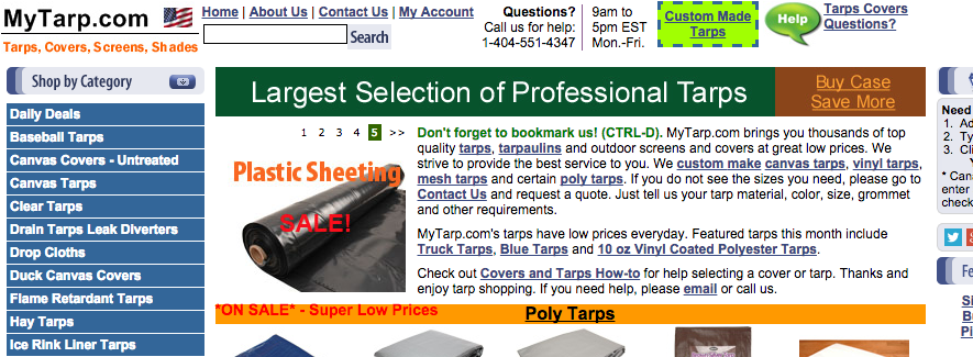
Here is a screenshot of the top half of mytarp.com—
Spend 30 seconds looking at it and tell me which page element grabbed your attention the strongest.
[Don’t scroll down till you’ve made your selection]For me it was the ugly neon green “Custom Made Tarps” message. Assuming mytarp.com makes highest margin on their custom products (which they most likely do) getting homepage visitors to click “Custom Made Tarps” is a super serious business goal. And I’m pretty sure that ugly neon sign is getting the highest number of homepage clicks.
Had mytarp.com CEO hired a world class graphic designer for $500/hour she would likely have got a really amazing graphical element for “Custom Made Tarps” but it would most certainly have a click-through rate that’s lower than our ugly neon message. But if that $500/hour graphic designer can’t improve custom made tarp sales then what’s their purpose?
Design has diminishing returns. Let’s set 3 design levels— ‘horrible’, ‘neat & clear’, and ‘mind-blowingly beautiful’. If horrible design costs x, ‘neat & clear’ will cost you 2x and ‘mind-blowingly beautiful’ will cost you 8x. ‘Horrible’ design hurts conversions so moving from ‘horrible’ design to ‘neat and clear’ is the right thing to do every single time. But the relative difference between ‘neat and clear’ and ‘mind-blowingly beautiful’ is so small that it’s pretty much best to avoid ‘mind-blowingly beautiful’. I’m not saying all ‘mind-blowingly beautiful’ projects are bad but in order to pull off a ‘mind-blowingly beautiful’ design the ecommerce entrepreneur himself needs to have a very good understanding of great design. If that isn’t you then don’t spend your money on that super amazing designer you heard about. Chances are this designer doesn’t understand ecommerce and will defend his work even if it leads to net lower conversion rates. If you’re the type of ecommerce entrepreneur who doesn’t focus on metrics like conversion rate then you should ignore this post. For the rest of you keep this advice in mind as you plan your next site redesign.


