Blog
Artistic Email Signup Popup
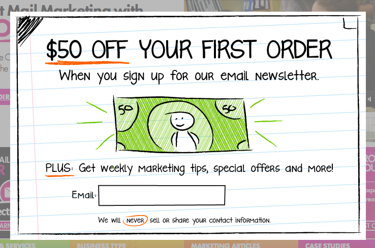
These days nearly every site has an email signup popup on their lading page. It must be flavor of the month. But most of these email signup popups look alike, which is probably why visitors instinctively close them. If you want your email signup popup to work you’re going to have to make it look different, in a good way. In October we saw an example from Harry and David where they use Facebook social proof to garner signups (link), before that we saw an example from bustedtees.com where they use clever copy to generate signups (link). Now, I’d like to share an example from postcardmania.com where they’ve used a hand-drawn design to get the visitor’s attention. I think it looks good (ignore the offer, focus on the design)—