Blog
A Request
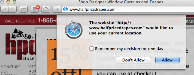
Please don’t force browsers to show a warning message that could freak shoppers when they land on your site. I saw this when I visited halfpricedrapes.com from my desktop computer—

Without even seeing actual opt-in rates for this pop-up I can bet it’s less than 15%. And the 15% that do allow halfpricedrapes.com to know their location probably click it by mistake. If you’re going to try a strategy like this please either A/B test it or annotate the date of change in Google Analytics and measure bounce rate metrics for the first week. If you see a 10% spike in bounce rate it’s probably due to this location request popup.


Comments 6
They should also probably A/B test the name of their website. I thought it was a typo in your post because I didn’t read their URL as half price drape. I read it as half priced rape.
Btw, the list to the list of 41 needs to be updated.
ReplyDerek
I mean the link to the list of 41.
ReplyI see it now. Thanks.
Replybetterretail
Great 🙂
ReplyYep, I had the same reaction looking at their url… Even if it was only a momentary bit of confusion, I think subconsciously people will associate their site the same way. My bet would be that it affects sales negatively too.
Replybetterretail
In their defense, I didn’t notice the alternate interpretation of their URL till Derek pointed it. Maybe you and Derek are the only people who noticed it??
Reply