
Case Studies
This Trick Improved Shopify Mobile Sales 11%
- Goals:
- Increase traffic to Oliver Cabell’s Shopify checkout page by educating shoppers on the company’s business model and competitive pricing
- Solution:
- Add a call to action in a high-visibility area on the product pages that educates shoppers on the company’s business model and competitive pricing
- Results:
- A 21.77% and 12.46% increase in traffic to the checkout page for mobile and desktop users, respectively
- 11.06% lift in revenue by product page traffic
Oliver Cabell is a premium shoe brand that has taken a direct-to-consumer approach. As a result, they’re able to provide high-quality sneakers, boots, and more at a much lower cost than other brands you may be familiar with.
Backstory
At Frictionless Commerce, we love working with companies that have unique stories to tell. That is certainly the case with Oliver Cabell as well.
Here’s what we’ve seen on most sites in the world: they don’t share their special stories with as many users as possible.
That’s money left on the table because shoppers — because people — respond to stories.
For Oliver Cabell, we wanted to find a way to share their unique story with as many shoppers as possible in order to help them see the value in buying sneakers here instead of elsewhere. Given our past experience, we knew this could have a positive impact on conversions.
Our Hypothesis
We believed that if we could share Oliver Cabell’s story on all product pages in a visible, but not distracting way, then we could see a lift in traffic visiting the checkout page and a lift in revenue.
Test Concept
For this test, we ran two variations: Variation 1 on desktop traffic and Variation 2 on mobile traffic. We had previously launched a version of this test where all traffic saw both variations, but we saw early on that desktop traffic responded well to one variation while mobile traffic responded well to the other variation. After that realization, we relaunched the test showing one variation to each device category.
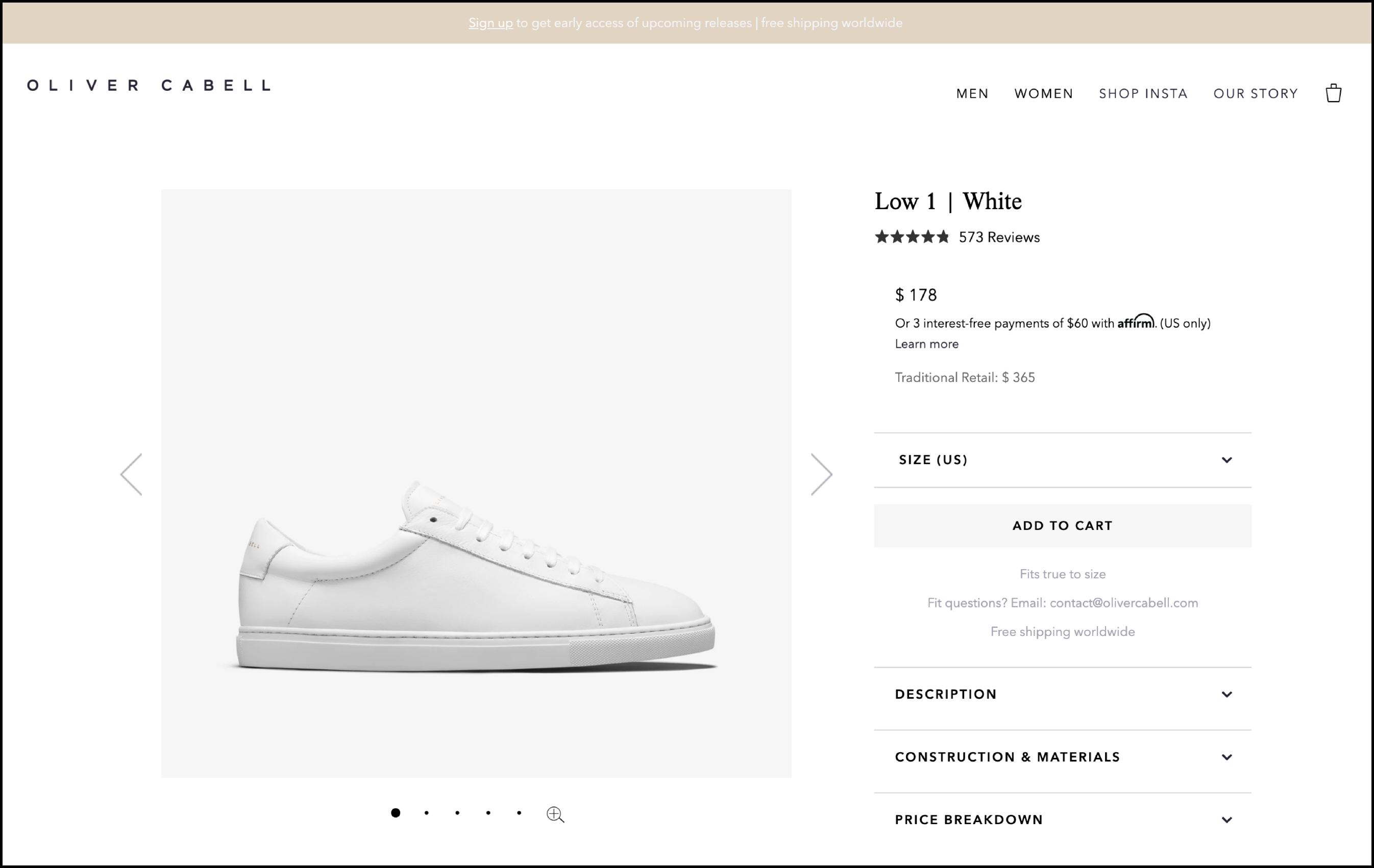
To help orient you, here is what the control looked like before our changes:
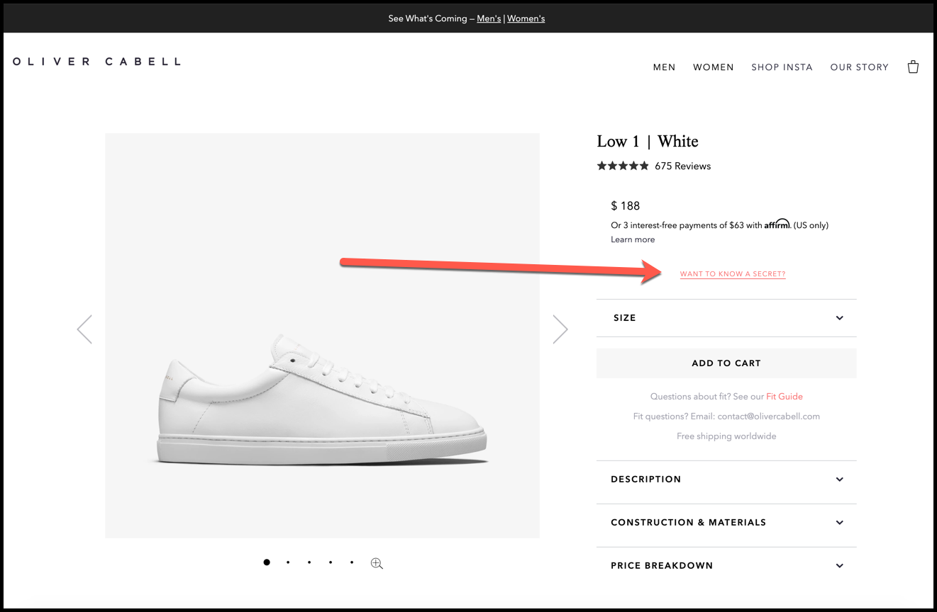
Variation 1
For desktop users, we hid the “Traditional Retail” section and replaced it with our “WANT TO KNOW A SECRET?” call to action:
On click, we showed this lightbox window (click the image below for zoomed view):

In this lightbox window, we’re showing why Oliver Cabell was founded and how their prices compare to the competition.
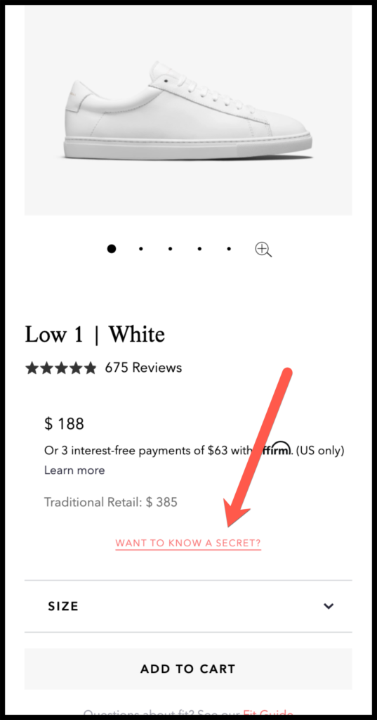
Variation 2
For mobile users, we placed our call to action below the “Traditional Retail” section:
On click, we showed this lightbox window (click the image for a zoomed view):

This variation is a bit more visual and slightly less copy-heavy for mobile users, who are confined to a smaller screen.
Results
For this test, as with all our A/B tests, we used Visual Website Optimizer (VWO) to split our traffic and track our data.
Our primary goal for this test was to drive more traffic to the checkout page. For both variations, we achieved this goal.
After 3 weeks of testing, Variation 1 (desktop users) resulted in a 12.46% lift in traffic to the checkout page.
Variation 2 (mobile users) resulted in a 21.77% lift in traffic to the checkout page.
Additionally, these two variations resulted in an 11.06% lift in revenue from product page traffic.
Why Our Concept Won
Our concept increased the visibility of Oliver Cabell’s unique story. As we said earlier, stories resonate well with shoppers (and people in general). Shoppers want to know what separates you from the competition. By telling them on the product pages, we’ve provided shoppers with a point of assurance that gives them the confidence to place an order.
More Evidence
%
Tiege.com was already doing really well. They wanted to see how much further test to paid search landing page could be pushed.
Read Case Study%
What's better than a sales pitch that converts? A personalized sales pitch that converts.
Read Case Study%
Stix is on a mission to disrupt the golfing game. Consumers don't just buy a new golf club. A lot goes into that purchase.
Read Case Study%
Glemnetic.com is a leader in its space. We wanted to see if we could push conversion rates higher.
Read Case StudyARE YOU OUR NEWEST CASE STUDY?
We are laser focused on the type of client that our methodology and skills will give the highest return on investment and so if you meet our criteria for taking on new projects, we are confident you will see results like these.


