
Case Studies
“Why We Exist” Explanation Increased Revenue Across ALL Product Pages by 6.90%
- Goal:
- Address the issue of shoppers not knowing what makes Connecting Threads special and, as a result, increase conversion rates across all product pages.
- Solution:
- Craft a call to action and lightbox window message that tells your “why we exist” story (article) to make the shopper comfortable with their potential purchase.
- Outcomes:
- Increase in conversion rates across all product pages.
- Increase in revenue across all product pages.
Connecting Threads is one of the top online quilting stores in the world. What makes them even more special is that their foundation is a team of actual quilters. Why does this matter? Well, here’s a question for you: would you rather buy a car from someone who has a license or from someone who’s never driven in their life?
We’re willing to bet you’d prefer the first option because you would feel a greater sense of assurance.
Backstory
More often than not, a site’s “About Us” or “Our Story” content is a big conversion booster. For Connecting Threads, we saw that users who visited their About Us page had a conversion rate 186% higher than the site’s average conversion rate. Although it may surprise you, that number is actually lower than it is for many sites. But this number still tells us that shoppers who learn about the company convert better.
Our goal then became to figure out how we can reach as many new visitors as possible with information about Connecting Threads—information about what makes Connecting Threads the best choice for quilting supplies.
We concluded that targeting every product page would be the best way to reach the most shoppers (who have at least a bit of purchase intent).
Our Hypothesis
We believed that we could drive at least a $10,000 lift in sales within 4 weeks across all product pages if we: 1) created a compelling call to action near the ‘Add to Cart’ button, and 2) created a lightbox window that appears after clicking the call to action and provides the shopper with information about what Connecting Threads is. Shoppers want to know who they’re buying from and why they shouldn’t buy elsewhere.
Test Concept
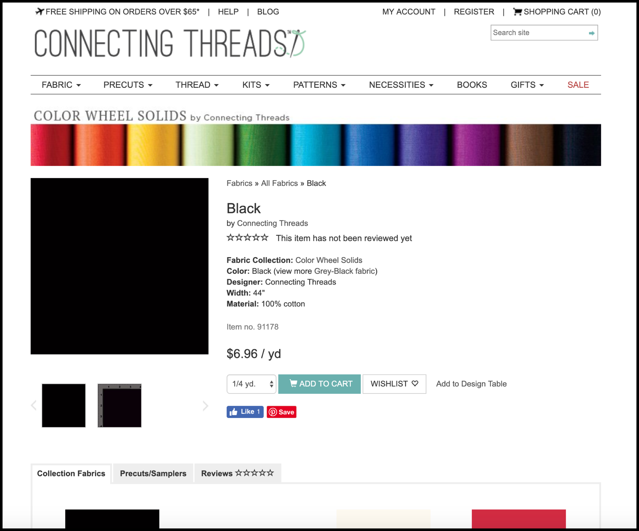
To test our hypothesis, we created two concepts with the goal of testing 2 call to action designs and 2 different messages. To orient yourself, first take a look at the control page that we worked on:
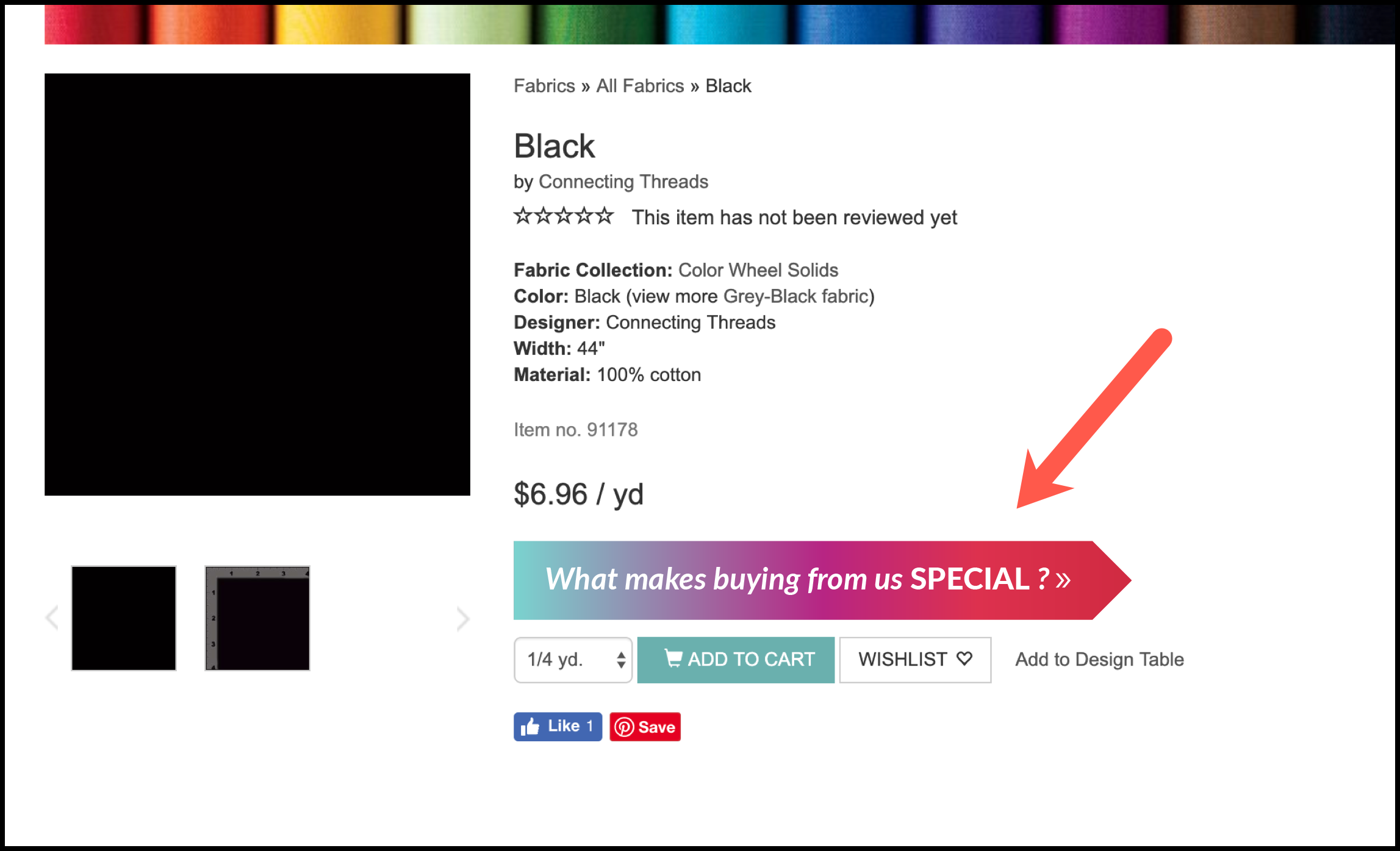
Variation 1
For both Variation 1 and Variation 2, we added a call to action just below the product price and above the Add to Cart button. This call to action is strategically placed: shoppers’ eyes naturally move to the product price when on a product page, so we placed our call to action close by.
This is the call to action for Variation 1:
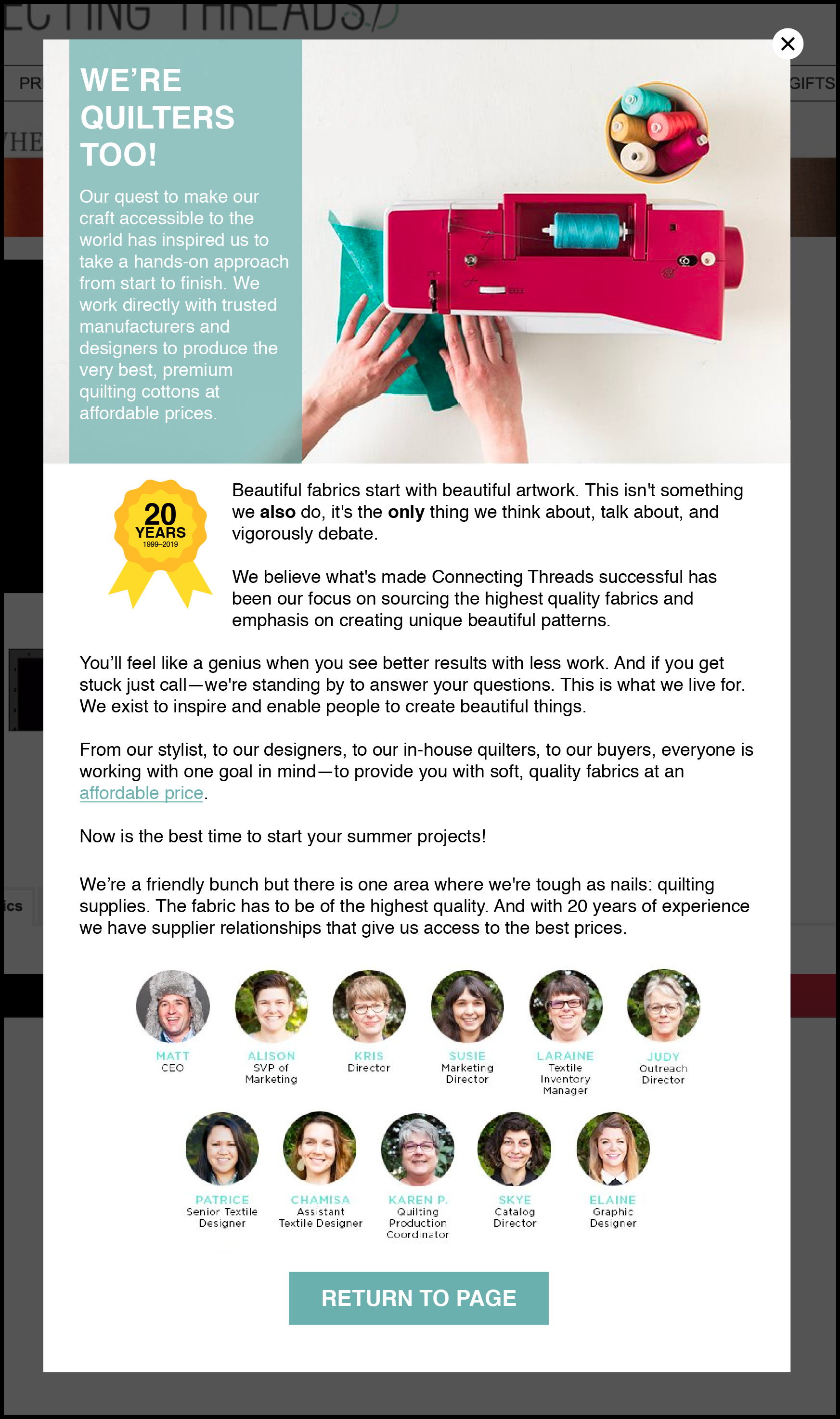
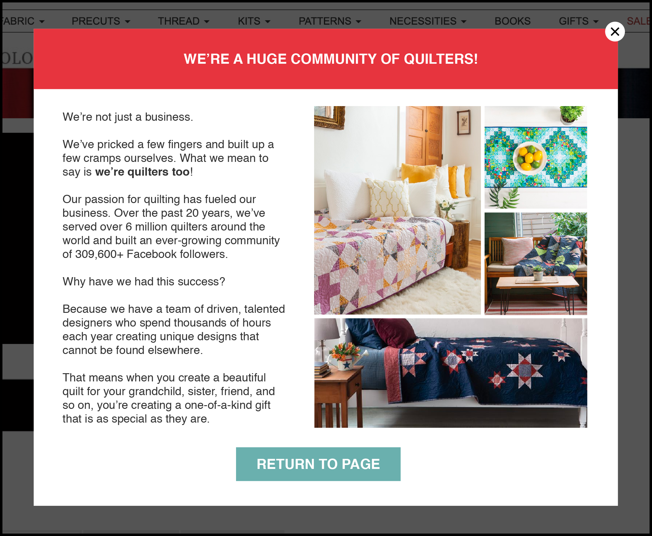
Once clicked, shoppers were shown this lightbox window:
Variation 2
For Variation 2, we tested a more subtle call-to-action design (i.e. no gradient effect). See below:
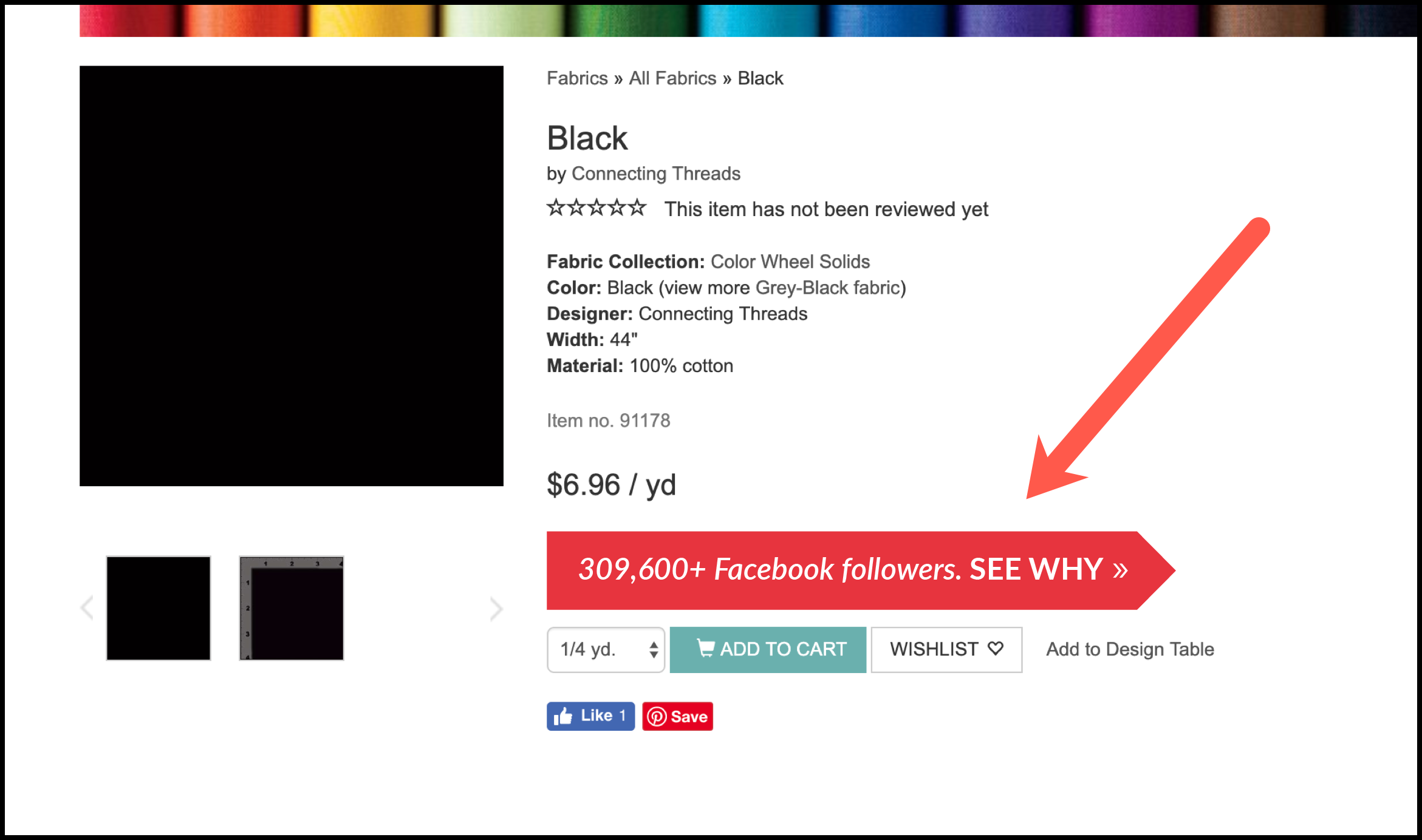
As for the copy, we wanted to lead in with social proof to create more trust in the shopper. Once the call to action was clicked, shoppers were shown the following lightbox window:
Outcomes
The testing tool we use is Visual Website Optimizer, which allows us to set up click-tracking goals. For this A/B test (or A/B/C test, rather), we targeted mobile and desktop traffic and we set up 1 click tracking goal: clicks on the calls to action for Variation 1 and Variation 2.
Our primary goal for this test was to reach at least a 5% lift in revenue on one variation with at least 95% confidence. Due to Connecting Threads’ high traffic and transaction rate, we were able to see results within a 4-week test period (which is ideal).
After 4 weeks, we were able to reach and exceed our primary goal of a 5% lift in revenue on Variation 2. Variation 2 resulted in a 6.90% lift in revenue across all product pages at 97% confidence.
Why Our Concept Won
Our concept provided additional points of assurance in a strategic location to provide shoppers with the confidence to move forward with adding a product to their cart. Our messaging has been placed by the product price in an attempt to show the shoppers the value of buying from Connecting Threads vs the competition.
In our lightbox window messaging, we talk about how big the Connecting Threads community is, how long they’ve been in business, and how many customers they’ve served to provide multiple points of assurance. More importantly, we’ve allowed the shopper to connect with the site on a much more personal level by mentioning that Connecting Threads is composed of quilters who have shared the shopper’s experiences.
More Evidence
%
Tiege.com was already doing really well. They wanted to see how much further test to paid search landing page could be pushed.
Read Case Study%
What's better than a sales pitch that converts? A personalized sales pitch that converts.
Read Case Study%
Stix is on a mission to disrupt the golfing game. Consumers don't just buy a new golf club. A lot goes into that purchase.
Read Case Study%
Glemnetic.com is a leader in its space. We wanted to see if we could push conversion rates higher.
Read Case StudyARE YOU OUR NEWEST CASE STUDY?
We are laser focused on the type of client that our methodology and skills will give the highest return on investment and so if you meet our criteria for taking on new projects, we are confident you will see results like these.


