Case Studies
32.38% Lift in Sales for Best Seller
- Goal:
- One of the best-sellers on Silverfernbrand.com is the Ultimate Probiotic Supplement. Our goal was to increase sales of this probiotic by optimizing the product page.
- Solution:
- Our idea was to ask users what health issue they experience, then show them real customer reviews that address that exact issue.
- Outcome:
- 32.38% lift in sales on this product page.
Backstory
We love working with businesses that have solved big problems. Silver Fern™ Brand is one of those businesses. The problem? Most probiotics are ineffective because they don’t contain what their labels say and they don’t survive long enough to reach your gut. Silver Fern™ has its probiotic’s strains DNA verified by a third-party lab. Their probiotic is 100% guaranteed to survive through the acidic environment of your stomach.
Our Hypothesis
If we can get users to tell us the specific health issues they experience and show them customer reviews that talk about how the Ultimate Probiotic helped address those exact issues, then we can get users to see the value in this probiotic. In turn, this will increase conversions.
Test Concept
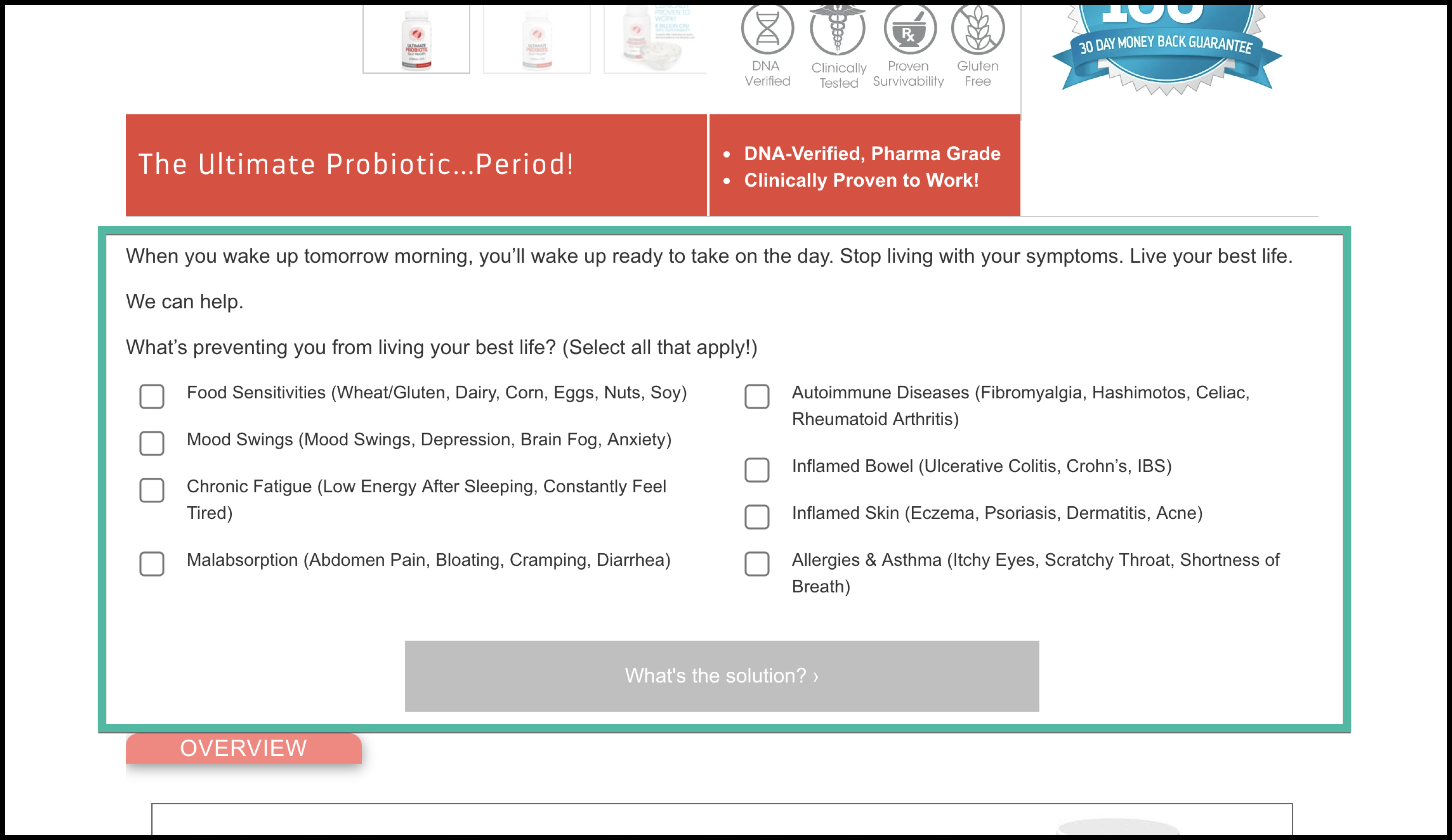
While working with Silver Fern™, we learned about the 8 biggest signs that someone may have a “leaky gut”. These are the signs: food sensitivities, mood issues, chronic fatigue, malabsorption, autoimmune diseases, inflamed bowel, inflamed skin, and allergies & asthma. That’s a pretty big list, so we knew that anyone coming to this product page likely experiences one or more of these.
Near the top of the product page (just below the fold), we added the section in the green box below:

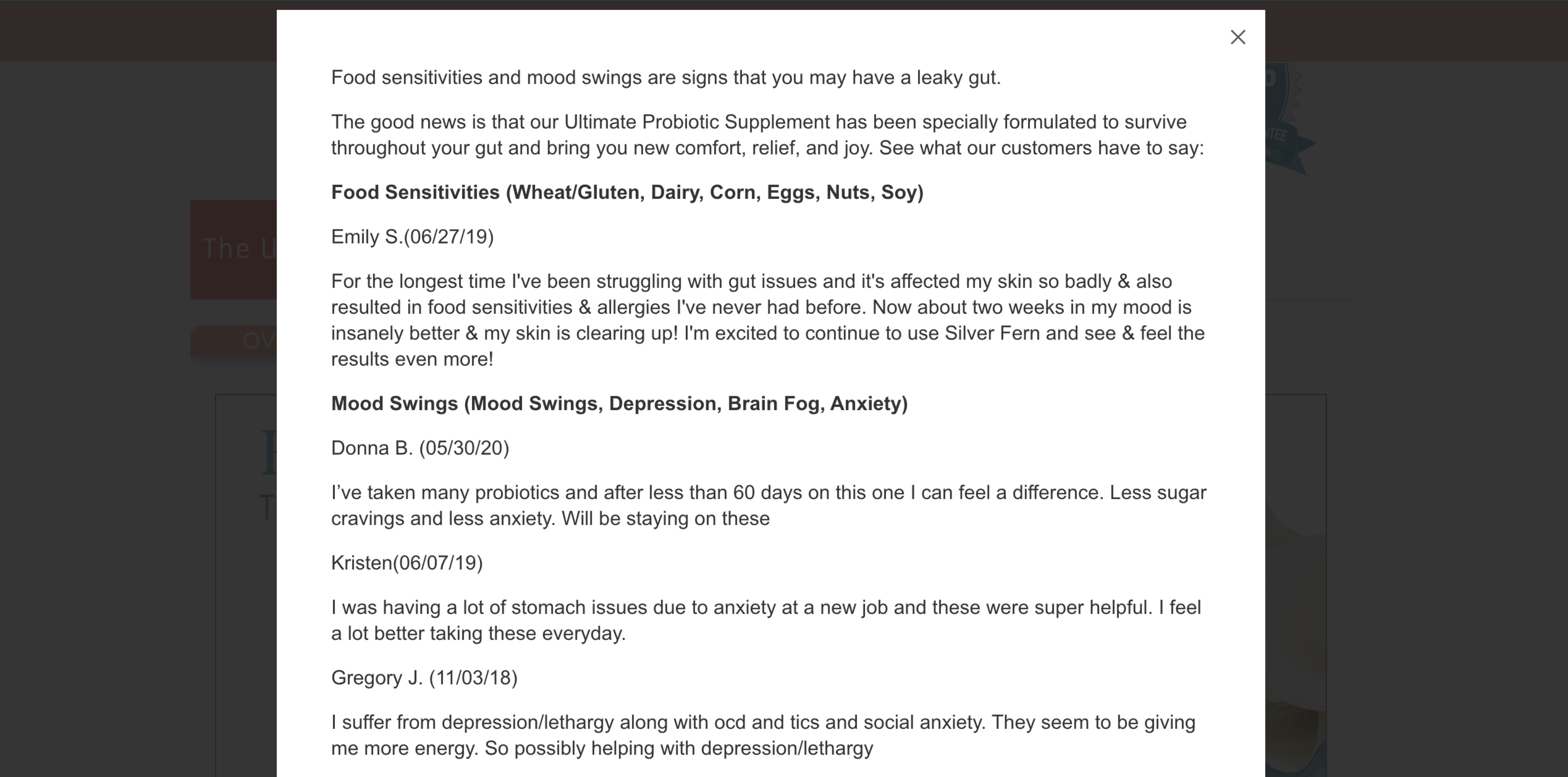
After a user selects the symptom(s) they are experiencing and clicks the “What’s the solution? >” button, they see a lightbox window that features reviews related to the user’s selection. For example, if a user selects “Food Sensitivities” and “Mood Swings”, they see this:

As you can see, the customer reviews that are shown are directly related to the symptoms that were selected earlier.
Outcome
We ran this as an A/B test and, after 2 weeks, our variation was declared the winner. It improved conversions by 32.38% and revenue by 32.32%.
Why Our Concept Won
We believe our concept won because it immediately addressed the main issue that was important to the user. Instead of relying on the user reading through all the content on the page to hopefully learn about how the Ultimate Probiotic could alleviate their health issue(s), we brought that content directly to them at the top of the page. Better yet, we didn’t even make a pitch to the user — Silver Fern™’s real customers did with their reviews!
More Evidence
%

Tiege.com was already doing really well. They wanted to see how much further test to paid search landing page could be pushed.
Read Case Study%

What's better than a sales pitch that converts? A personalized sales pitch that converts.
Read Case Study%

Stix is on a mission to disrupt the golfing game. Consumers don't just buy a new golf club. A lot goes into that purchase.
Read Case Study%

Glemnetic.com is a leader in its space. We wanted to see if we could push conversion rates higher.
Read Case StudyARE YOU OUR NEWEST CASE STUDY?
We are laser focused on the type of client that our methodology and skills will give the highest return on investment and so if you meet our criteria for taking on new projects, we are confident you will see results like these.


