Case Studies
Giesswein Bestseller Sales Up 29.28%
- Goal:
- The bestseller on Giesswein.com is their women’s merino wool runners. This is also their most important product and the client wanted to know if there was a way to convert more new buyers.
- Solution:
- Our core philosophy is that the product page is the most important page. It’s here that the buyer makes the all-important buy/no-buy decision. On the original page the client the basic details were given. Our idea was to craft the world’s best merino wool story.
- Outcome:
- 29.28% improvement.
Backstory
Giesswein is a really interesting Austrian company. They’ve been in the wool manufacturing business since 1954. Then, in 1972 they started perfecting woolen slippers.
And 4 years ago, they had a new challenge, “Why are the biggest innovations in women’s running shoes around shape and color?”
This is how women’s merino wool runners were born.
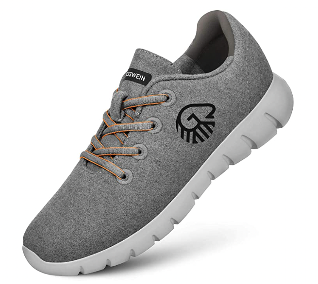
Our Hypothesis
While the product description covered all the details about the product we felt more could be done to convert shoppers who were into running but new to Giesswein or new to woolen running shoes.
Control
Here is a screenshot of what the page looked like before we got started.
Test Concept
There was no doubt that the product looked damn good.
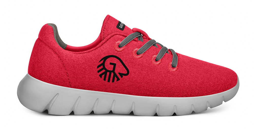
But we didn’t want to rely on looks to make the sale. Those people were already converting. The challenge was, “how do we convert people who are engaged on the page but just not engaged enough to pull the trigger?”
This, then, was the group we were after.
Turns out, woolen shoes are quite a remarkable innovation. In our client interrogation (before starting the project we pepper clients with hardball questions) we discovered some fascinating details about these runners.
So we totally reimagined how the product story was being told on the page.
Video Walkthrough of Changes We Made
Here are the changes we made:
– In opposition to “best practices” we decided to increase the page word count. We didn’t want to limit ourselves to some arbitrary word limit. Our goal was to maximize conversions and there were some really important details that need to be discussed.
– We really drove into the technical superiority of woolen shoes. Then we talked about how merino was another step up. Finally, we explained how Giesswein’s 70 years of experience running wool looms played a big role.
– In our 9-point conversion copywriting process point #7 is that shoppers love personalized experiences. We knew some shoppers might care more about sustainable cruelty-free ethical sourcing while others might care about water resistance and some others would care about both those details. So many permutations and combinations. The trouble was if we talked about all these details the page would get unmanageably long. So we allowed users to choose their own adventure! Screenshot:
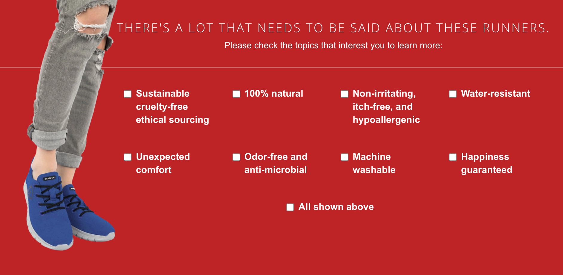
The beauty of this approach is that it gives power to the reader while also dramatically shortening the default page content. If a methodical shopper wants to read all the info, great, have at it. But if someone really just cares about our return policy they will click the happiness guaranteed checkbox and instantly get their answer and checkout.
You’ll remember we also tested this menu item approach on Silverfernbrand.com’s Ultimate Probiotic Supplement and there too it had a 32.38% lift.
Outcome
Ran the test for 7 weeks and ended up with a 29.28% lift in conversion rates:

Why Our Concept Won
Stories matter. In our quest to remove friction, we sometimes forget the power of storytelling. But not just that, how the story is presented, how the tension is added, and how the reveal is made, all matter. This test concept told a compelling story. And that’s the only reason why the concept won.
PS: Allbirds.com, we see you, and we’re coming for you.
More Evidence
%
Tiege.com was already doing really well. They wanted to see how much further test to paid search landing page could be pushed.
Read Case Study%

What's better than a sales pitch that converts? A personalized sales pitch that converts.
Read Case Study%
Stix is on a mission to disrupt the golfing game. Consumers don't just buy a new golf club. A lot goes into that purchase.
Read Case Study%

Glemnetic.com is a leader in its space. We wanted to see if we could push conversion rates higher.
Read Case StudyARE YOU OUR NEWEST CASE STUDY?
We are laser focused on the type of client that our methodology and skills will give the highest return on investment and so if you meet our criteria for taking on new projects, we are confident you will see results like these.

