
Case Studies
How Understanding Shopper Psychology Boosted Product Sales 30.56% for Oransi.com
- Goal:
- Buying a home purifier is complicated. So many technical details. So much to consider. This is your family’s health after all. It’s an $899 unit, worth every penny, but still, it’s $899.
- Solutions:
- Recognize that some users like detailed descriptions and others don’t.
- People aren’t here to look at pretty pictures. They want to read. Make reading easy.
- Outcome:
- Improved product sales by 30.56%.
Not enough attention is paid to product descriptions. Once written, it’s seldom tested.
Also, we assume no one will read long detailed content. We’ve seen a trend where eCom sites have significantly trimmed down their product descriptions. Last week I saw a product page with just 2 sentences in their product description. Now that’s crazy.
Reality: your product page is visited by two audiences: Skimmers and Diggers. Some of us are Diggers (we’ll read a 2,000-word essay if the content is solid) while others just want the summarized version of the story, they’re the Skimmers.
The Problem
Marketing teams debate hard, consider all shopper types, and make a decision about content length. The person missing from this marketing meeting is your actual shopper, the person pulling out their credit card.
Our Hypothesis
Our thesis was that some people who land on this EJ120 page will have time and want to read all the technical specs (MERV17 rating, quiet German motor tech, 0.3-micron filtering). Riveting for some.
Others wouldn’t have a lot of time and would just want the most important details.
Our Treatment
We like to gamble but we don’t bet the farm on one idea, so we created 4 treatments.
This case study is about Variation 4.
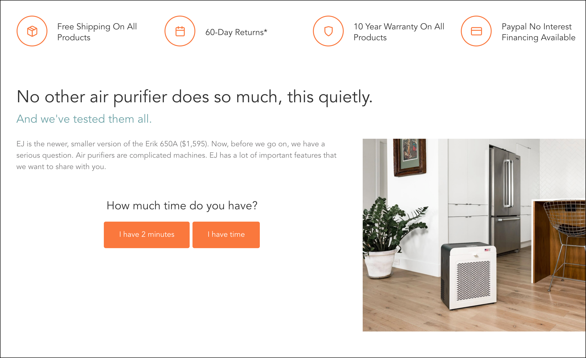
Visitors to Variation 4 saw this in the main description area of the page (see 2 orange buttons below):
Key Changes:
1: On the original page the background color was a slightly darker shade of grey. But the foreground text is also in grey. Since our entire idea hinged on people reading our persuasive copy we wanted to ensure it was readable. So we lightened the background to make the text pop more. Content design makes a huge conversion difference.
2: We added a persuasive headline:
No other air purifier does so much, this quietly.
And we’ve tested them all.
This isn’t just any headline, it’s developed based on The 9 Truths About Online Shoppers. The idea is to let users know they don’t have to worry about testing other air purifiers, we’ve tested them all for them.
3: Perhaps the most important change we made was adding this question: How much time do you have?
Now, instead of guessing what type of reader was seeing the page, we let them identify themselves.
Why doesn’t this exist? So simple, yet we’ve never seen this before.
We knew Skimmers would be drawn to the {I have 2 minutes} button. On click, they were shown the quick elevator pitch. The word count might have been cut but we made sure every word counted.
Diggers, on the other hand, would favor the {I have time} button. And when that was clicked we showed everything, in incredible detail.
The Results
We tracked this test closely, it was, after all, a radical change. Variation 4 (above) performed significantly better than the Control every single week.
The test ran for 4 weeks. You can see all 4 Variations did well, but Variation 4 performed the best: 33.17% lift with 99% stat sig.
Now, VWO (our A/B testing solution we’re using) is looking at the overall impact. What we really want to understand is how EJ120 unit sales went up.
So we connected VWO data with Google Analytics and looked at the raw numbers and ran it through a statistical calculator. Turns out, unique unit sales of EJ120 were up 30.56%. Statistical significance of 98.51%.
More Evidence
%
Tiege.com was already doing really well. They wanted to see how much further test to paid search landing page could be pushed.
Read Case Study%
What's better than a sales pitch that converts? A personalized sales pitch that converts.
Read Case Study%
Stix is on a mission to disrupt the golfing game. Consumers don't just buy a new golf club. A lot goes into that purchase.
Read Case Study%
Glemnetic.com is a leader in its space. We wanted to see if we could push conversion rates higher.
Read Case StudyARE YOU OUR NEWEST CASE STUDY?
We are laser focused on the type of client that our methodology and skills will give the highest return on investment and so if you meet our criteria for taking on new projects, we are confident you will see results like these.


