Case Studies
Resolving Negative Thoughts Improved Conversions 15.95%
Note: if the name Ice Shaker sounds familiar it’s because you’ve seen them on Shark Tank, and know Mark Cuban and Alex Rodriguez invested in the company.
- Goal:
- Shopify conversion rate optimization for Ice Shaker’s best-selling category page.
- Solution:
- Craft copy that shows users that Ice Shaker understands and relates to their past experiences with competitor products, then explain how Ice Shaker is the solution they’re looking for.
- Outcome:
- Significant increase in conversion rates for shoppers on the 26oz Ice Shaker collections page.
Confidence is something that the team at Ice Shaker has in spades — and for good reason. Their shakers and tumblers take all the problems you may have experienced with other shakers and tumblers and solves them. What more could you ask for?
This confidence and ability to clearly explain how their product is better can be seen in their YouTube videos and their appearance on Shark Tank.
Backstory
While reviewing Ice Shaker’s site, we felt that this confidence wasn’t as prominent. But this is totally ordinary as it can be difficult for businesses to show shoppers who they are when all you have is a computer or phone screen to work with. However, with our copywriting strategy, we knew we could help out.
To begin, we focused on Ice Shaker’s best-selling category — the 26oz Ice Shaker. We also prioritized the mobile experience because of Ice Shaker’s high mobile traffic volume.
Our Hypothesis
We believed we could provide at least a 10% conversion lift for mobile traffic visiting the 26oz Ice Shaker collections page. How? By removing content that we believed was increasing cognitive load for the user and replacing it with a sales pitch that addressed their negative thoughts.
Test Concept
To orient yourself, first take a look at the original 26oz Ice Shaker collections page:
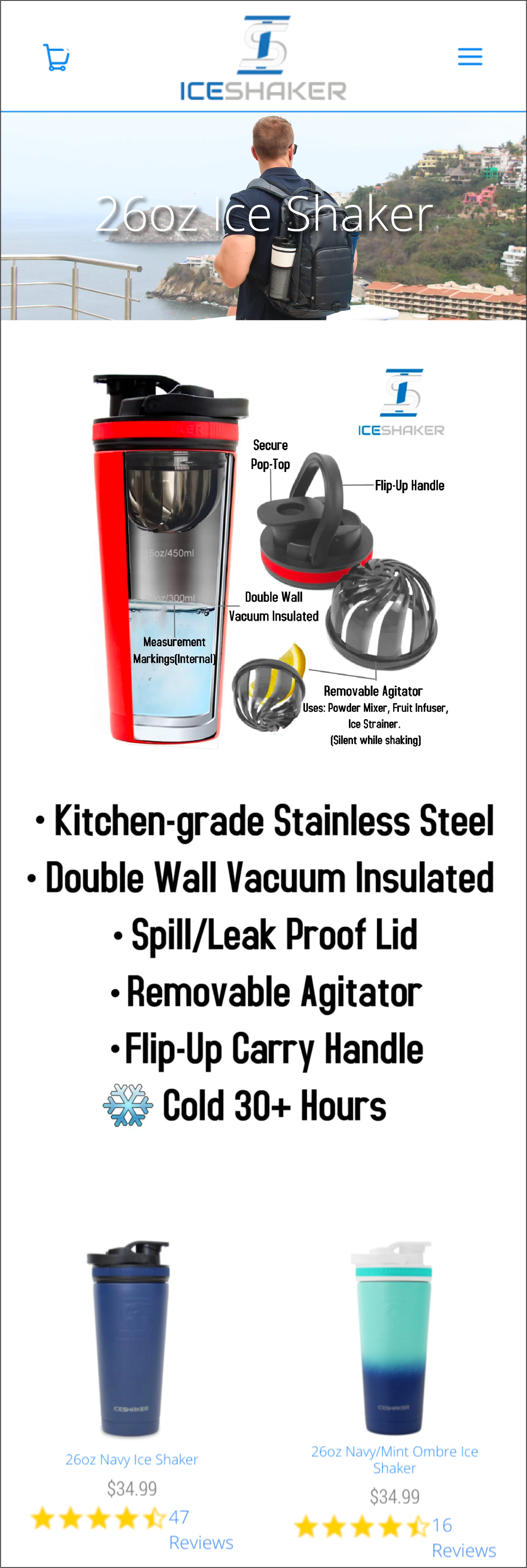
Below the bullet points was the product list.
Variation 1
In variation 1 of our Shopify conversion rate optimization concept, we removed the header image as we felt that it wasn’t adding value to the page. We then removed the infographic because the images and text were too small to read on a mobile device. Finally, we removed the bullet points.
In their place, we added new copy that we crafted to show users that Ice Shaker understood the problems they faced with other shakers. We used that to then explain how the 26oz Ice Shaker solves those problems.
Here is our copy:
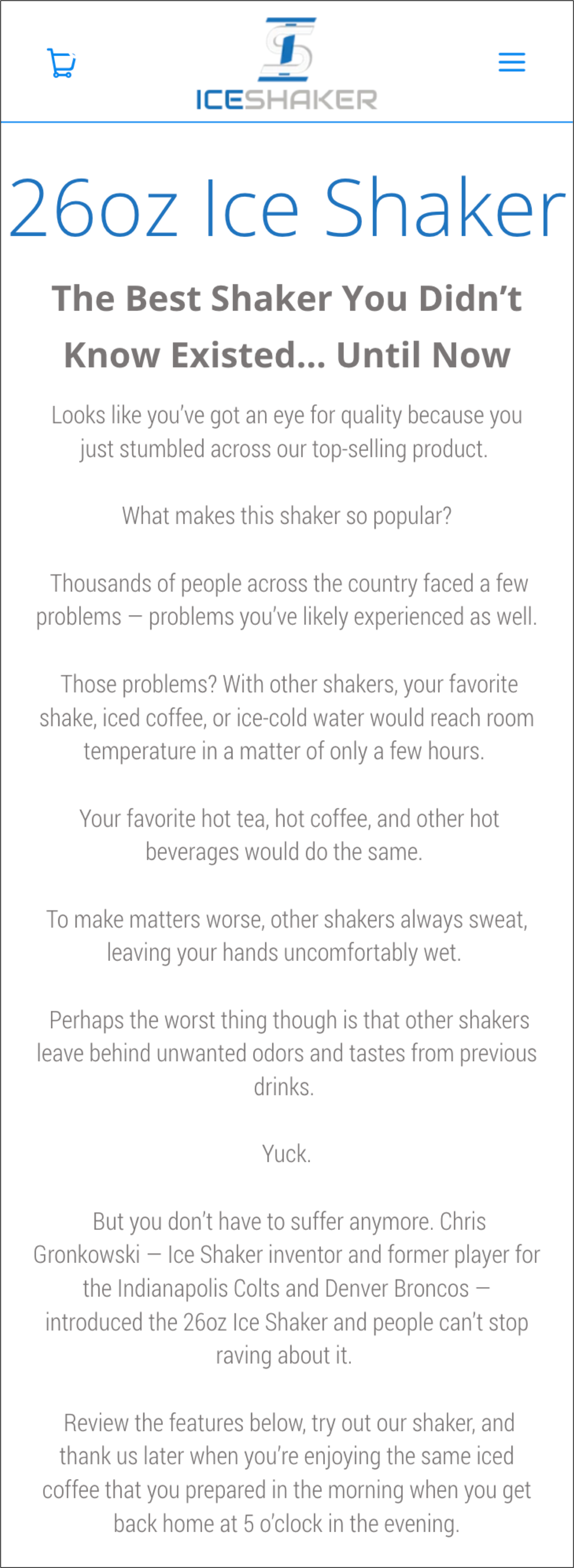
Below this copy, we added a bullet-pointed list of the product features. Additionally, we added this image and tile gallery to replace the infographic that was too small to read:
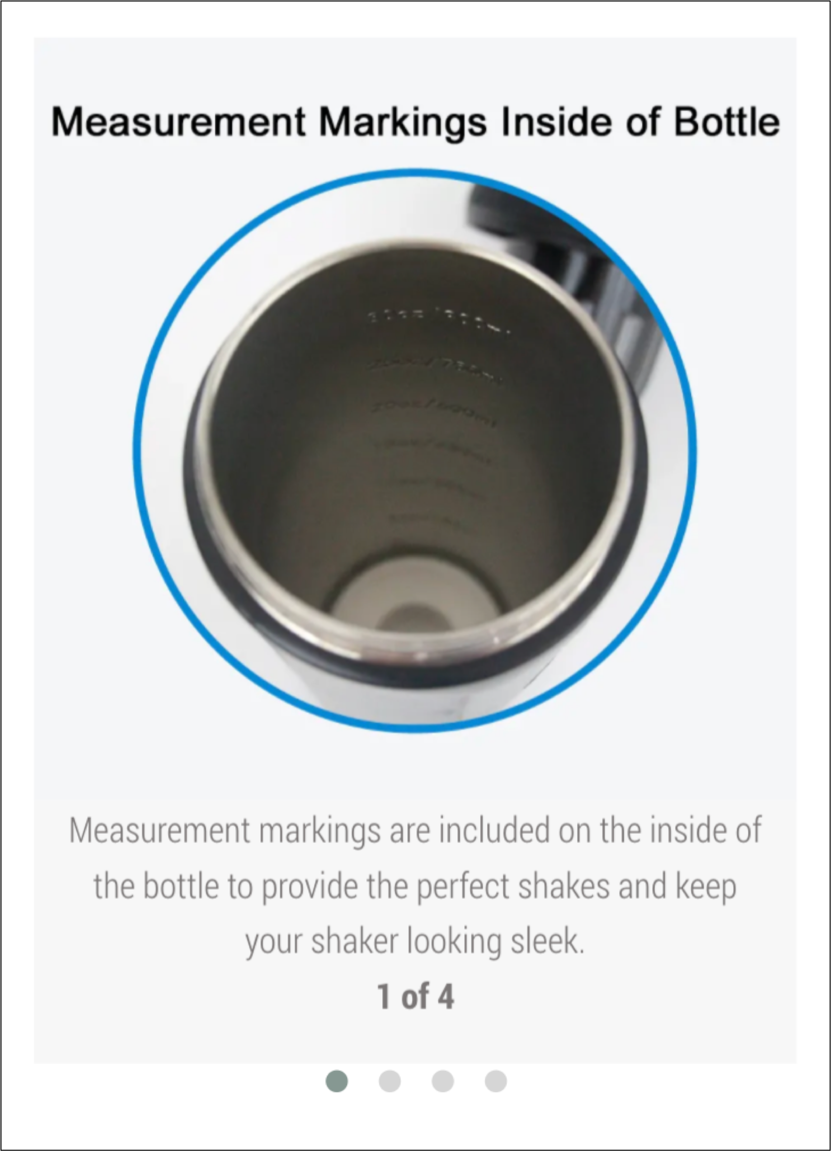
Instead of showing all product features in a single image, we showed the features one at a time with readable descriptions.
Outcome
Our primary conversion goal—the one we’d use to determine a test winner—was to see a 10% lift in completed orders at 95% confidence.
After running the test for 4 weeks, our test concept was declared a winner.
Over the 4-week period, the conversion rate for the control was 5.77%. Variation 1 saw a 15.95% lift for a conversion rate of 6.69%.
Additionally, Variation 1 saw a 14.81% lift in revenue.
Why Our Concept Won
Our Shopify conversion optimization concept brought to Ice Shaker’s site the same confidence that they have in their YouTube videos and elsewhere. We explicitly told shoppers about the problems that exist with competitor products and explained how Ice Shaker is the solution. Additionally, we replaced the original infographic with a new visual aid that was easier to read and comprehend.
Together, those changes resulted in a positive test outcome.
More Evidence
%
Tiege.com was already doing really well. They wanted to see how much further test to paid search landing page could be pushed.
Read Case Study%

What's better than a sales pitch that converts? A personalized sales pitch that converts.
Read Case Study%
Stix is on a mission to disrupt the golfing game. Consumers don't just buy a new golf club. A lot goes into that purchase.
Read Case Study%

Glemnetic.com is a leader in its space. We wanted to see if we could push conversion rates higher.
Read Case StudyARE YOU OUR NEWEST CASE STUDY?
We are laser focused on the type of client that our methodology and skills will give the highest return on investment and so if you meet our criteria for taking on new projects, we are confident you will see results like these.

