Case Studies
How Being Compared to Competitors Increased Conversions on Best Sellers by 15.92%
- Goal:
- Increase conversion rates for some of HandicappedPets’ best-selling products.
- Solution:
- Craft copy that explicitly explains why HandicappedPets is a better choice than their competitors.
- Outcome:
- Significant increase in conversion rates for shoppers on the target pages.
At Frictionless Commerce, there’s nothing we love more than working with a client who makes a positive difference in the world. As manufacturers of dog (and other small pet) wheelchairs since 2001, HandicappedPets perfectly embodies that type of client.
Their products have great importance as they allow families to improve the lives of their disabled pets and avoid euthanasia. As they say on their site, they “believe that our aging, disabled, and injured pets are family and deserve to live happy healthy lives.”
Backstory
While working on the HandicappedPets site, we saw an opportunity to increase conversions for best sellers. Something that sets HandicappedPets apart from the competition is their unique product design that makes their dog wheelchairs more comfortable, user-friendly, and reliable. They solved a number of problems that the rest of the market hadn’t.
The problem? This wasn’t being mentioned in high-visibility areas of the site!
Our Hypothesis
We believed we could produce at least a 10% lift in conversion rates if we crafted compelling copy directly on the best-selling product pages that discussed how HandicappedPets solved the problems faced by other dog wheelchairs.
Test Concept
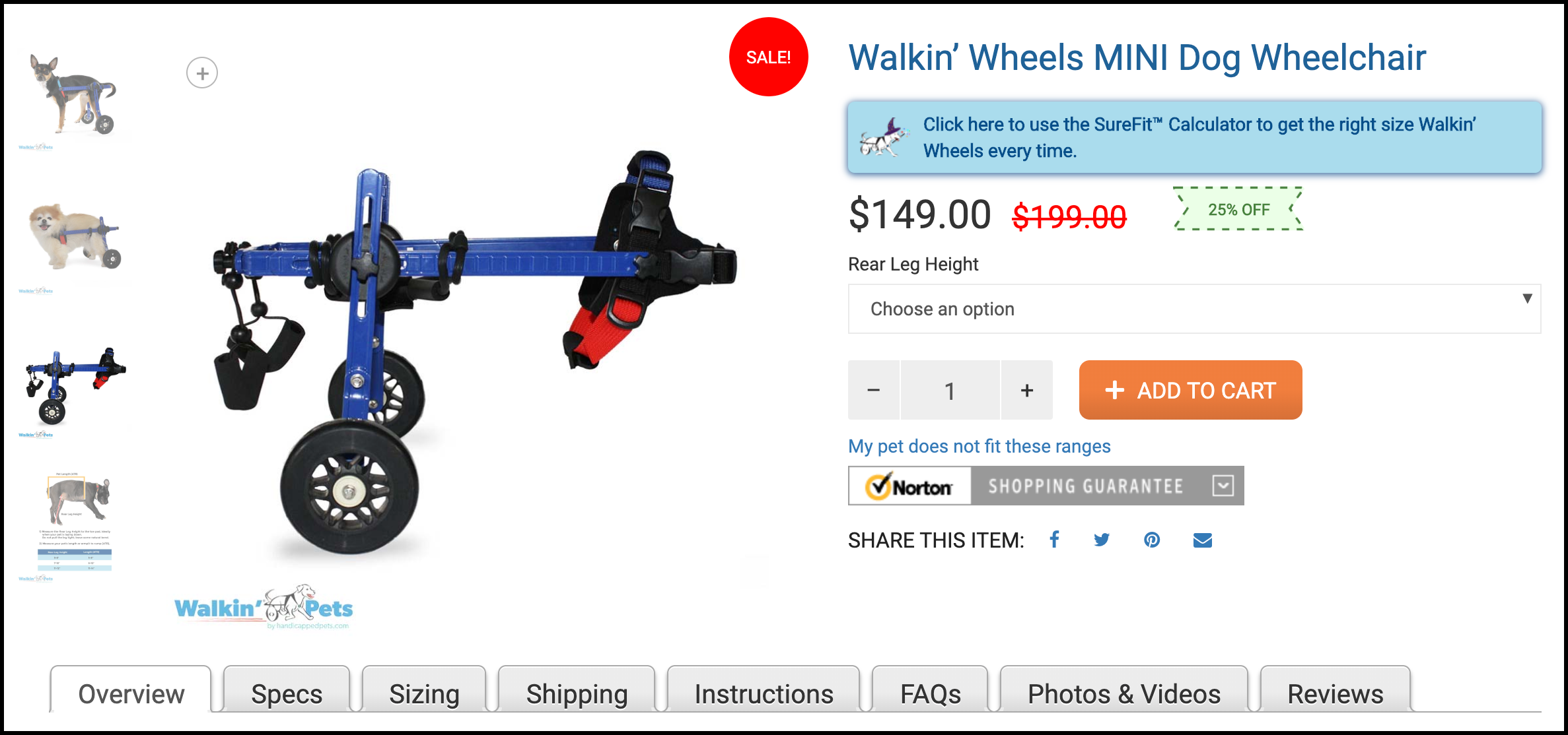
To test our hypothesis, we created two concepts. To orient yourself, first, take a look at the area we targeted on the original product pages:
Variation 1
First, we added a call to action below the ADD TO CART button and quantity selector:
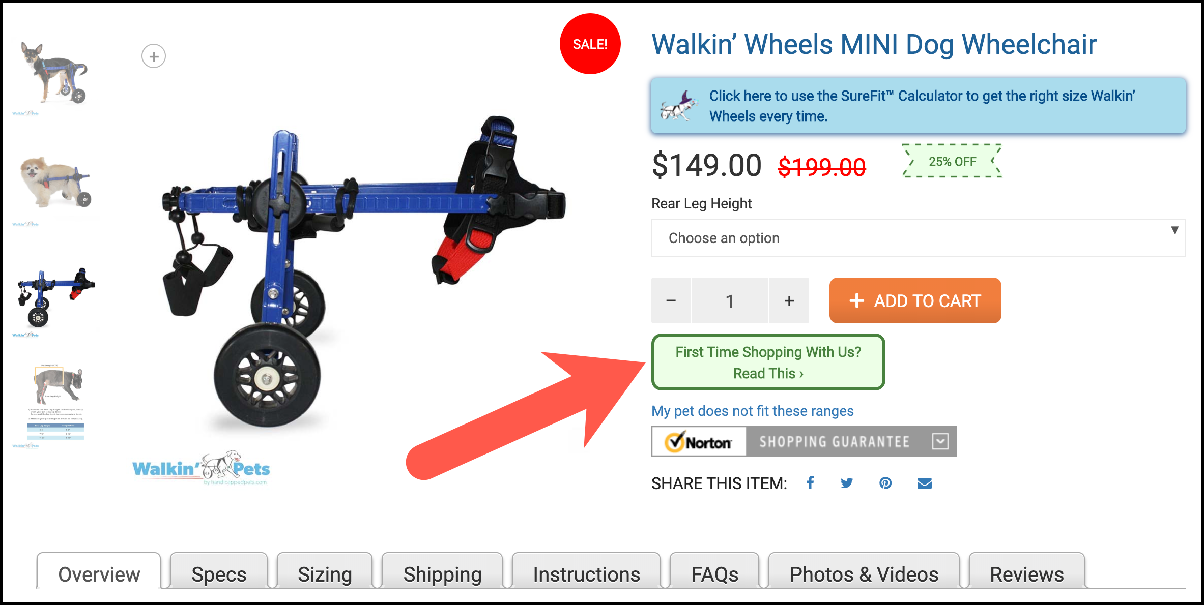
Our goal was to pique the interest of first-time shoppers. Our call to action reads, “First Time Shopping With Us? Read This >”, so we were confident that we’d get a significant number of clicks.
When a user clicked on our call to action, they saw this lightbox window and copy:
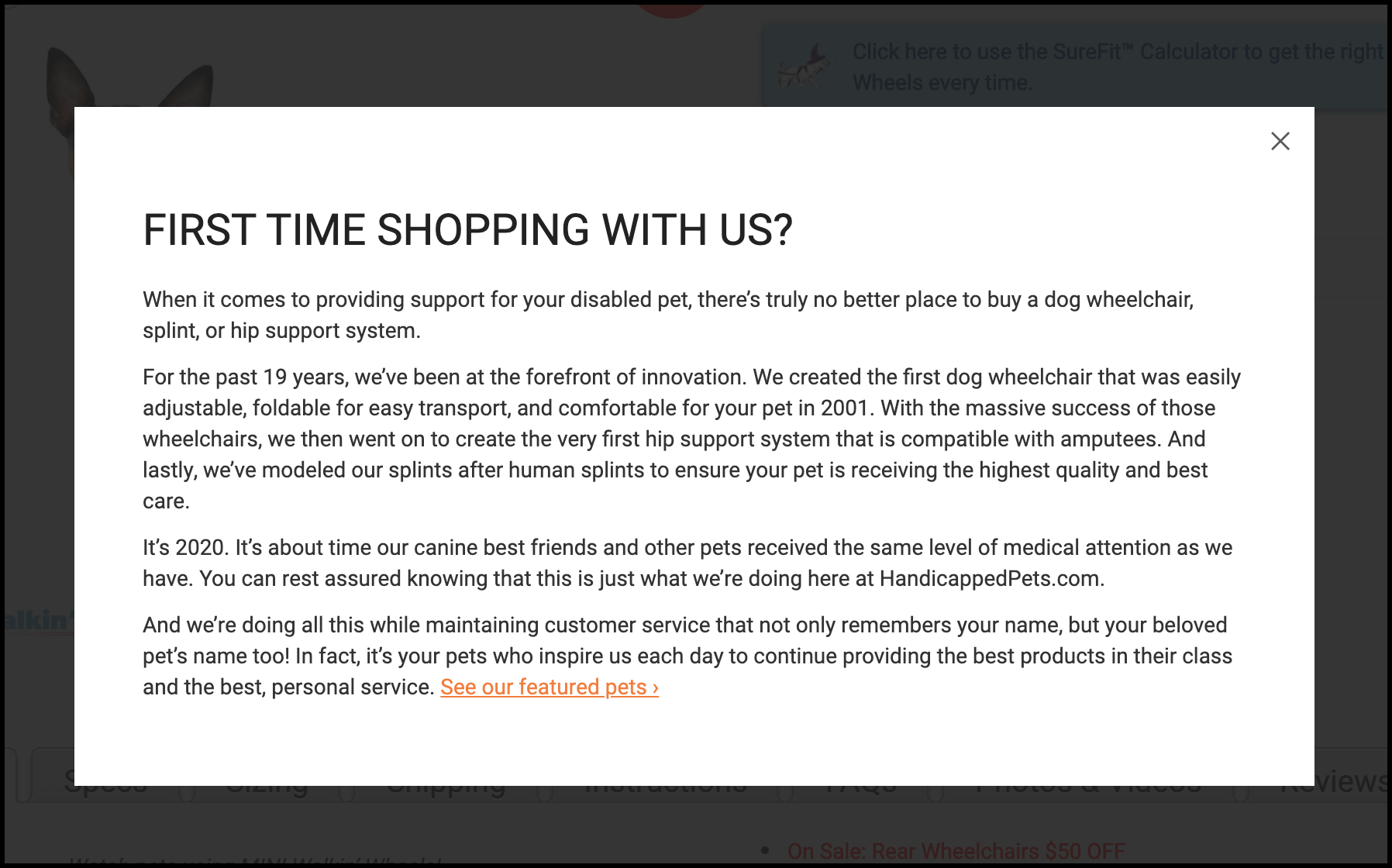
As you can see in our copy, we discussed how innovative HandicappedPets is and how their dog wheelchairs solved the problems faced by other companies (non-adjustable, unfoldable, uncomfortable).
Variation 2
In Variation 2, we tested a different call to action:
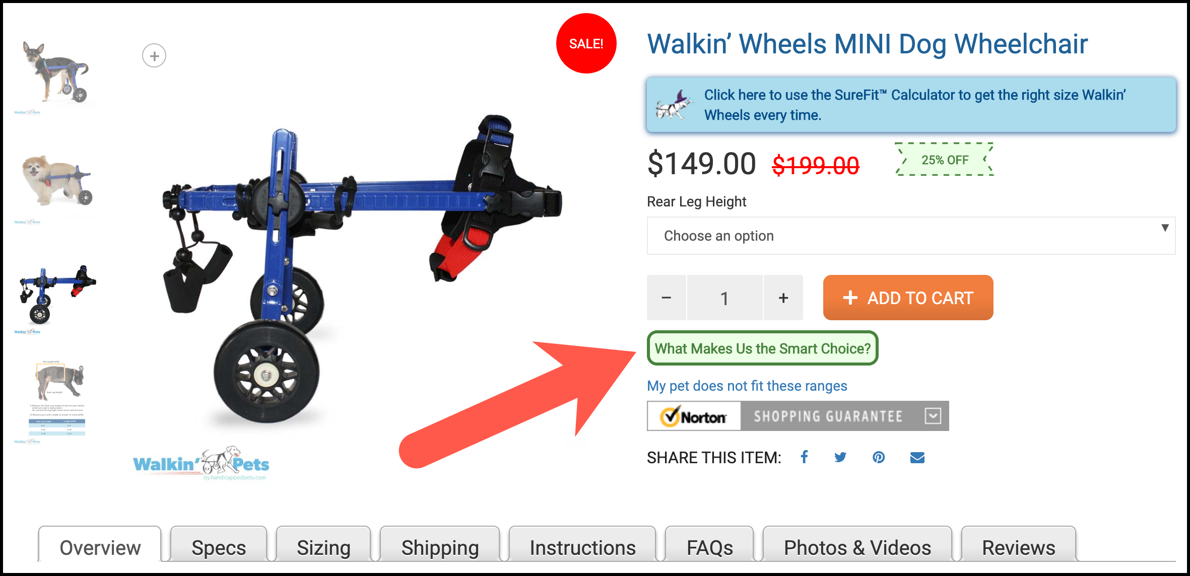
Our goal with this call to action was to ask an interesting question that we felt shoppers may have wanted the answer to. It turns out, the call to action in Variation 1 received more clicks.
In addition to changing the call to action, we also changed the lightbox copy for Variation 2:
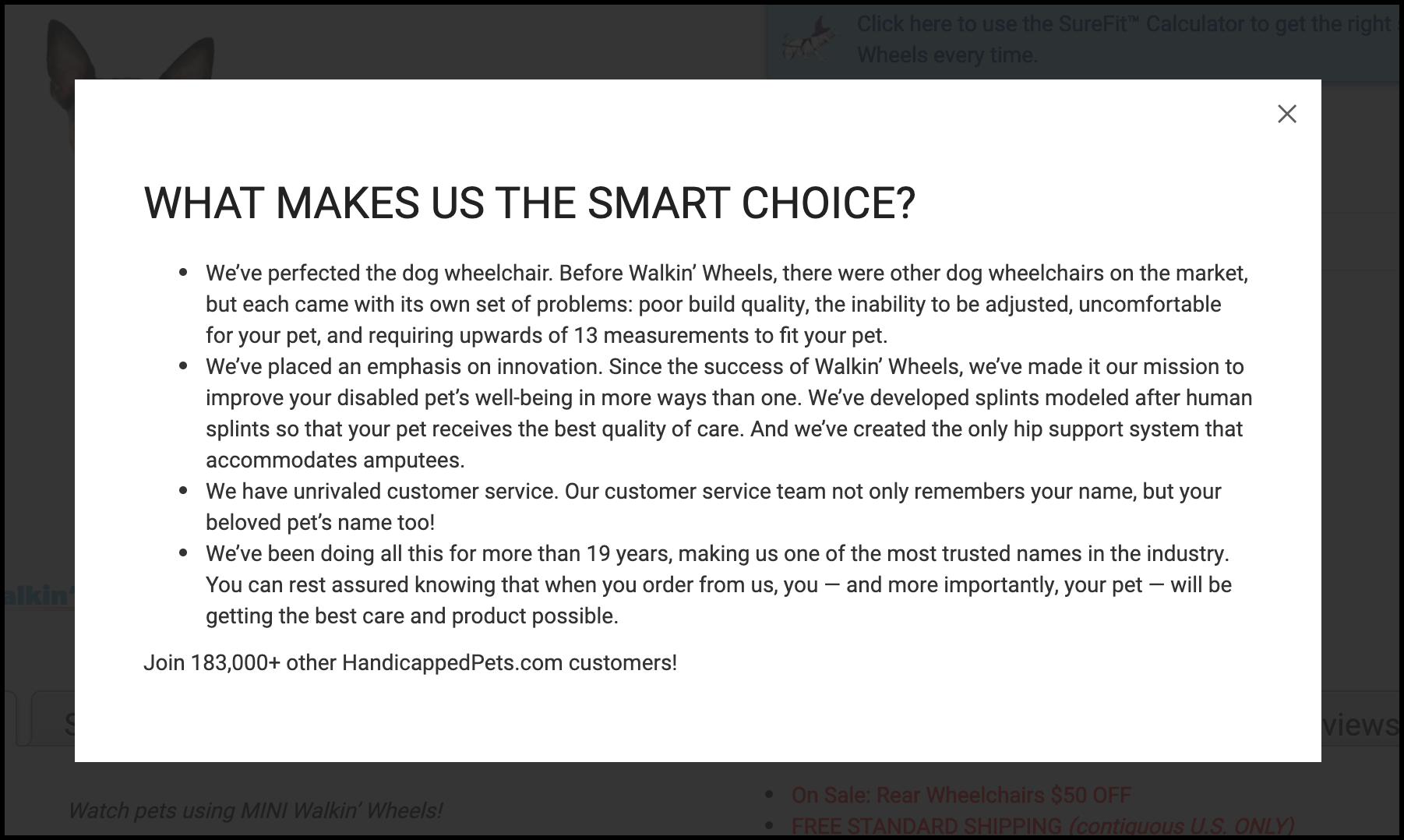
In this lightbox window, we wanted to do 2 things: 1) use bullet points to help with readability, and 2) be more aggressive with our language to show how confident HandicappedPets is that their product is the best.
Outcome
Our primary conversion goal—the one we’d use to determine a test winner—was to see a 10% lift in completed orders at 95% confidence.
After running the test for 6 weeks, both variations outperformed the control’s baseline metrics. However, Variation 2 certainly did the best as was declared the winner.
Over the 6-week period, the conversion rate for the control was 4.40%. Variation 1 saw a 6.82% lift for a conversion rate of 4.70%.
Variation 2, however, saw a 15.92% lift for a conversion rate of 5.10% at 96% confidence.
Even though Variation 1’s call to action received more clicks, Variation 2 significantly outperformed it, and even the control. This led us to start work on a follow-up test in which the call to action from Variation 1 is used with the lightbox window from Variation 2 (we’ll be launching that test soon).
Why Our Concept Won
Our concept used a strategically placed call to action and message to increase shoppers’ awareness about what makes HandicappedPets the best place to buy from if you have a disabled pet.
People don’t want to buy low-quality products. They want to know they are receiving the best. Most sites don’t actually make this case for themselves, or if they do, it’s typically hidden on a page like the About Us page (which typically sees less than 5% of a site’s traffic).
By bringing this content to the shopper on the product pages, we’ve increased the likelihood that they’ll see the value in HandicappedPets.
More Evidence
%
Tiege.com was already doing really well. They wanted to see how much further test to paid search landing page could be pushed.
Read Case Study%

What's better than a sales pitch that converts? A personalized sales pitch that converts.
Read Case Study%

Stix is on a mission to disrupt the golfing game. Consumers don't just buy a new golf club. A lot goes into that purchase.
Read Case Study%

Glemnetic.com is a leader in its space. We wanted to see if we could push conversion rates higher.
Read Case StudyARE YOU OUR NEWEST CASE STUDY?
We are laser focused on the type of client that our methodology and skills will give the highest return on investment and so if you meet our criteria for taking on new projects, we are confident you will see results like these.

