
Case Studies
15.92% Conversion Impact
Doesn’t eCommerce sometimes feel like a self-checkout lane at a grocery store?
Contrast this with a store experience where you have a conversation with a knowledgeable sales associate who tries to understand the context of your visit. And based on what you share, a recommendation is made.
This is what makes the offline experience so effective. I doubt that brick-and-mortar stores have 4% conversion rates.
But what’s preventing us from using this approach for eCommerce?
That’s what we tested.
THE SETUP
We know that not everyone wants this conversational experience, so we didn’t force it on them.
Instead, we added subtle nudges on the product page to let shoppers know we’re around if they need us.
In this test, we added one CTA near the product image (A in the screenshot below), one next to the price (B in the screenshot below), and one at location C:
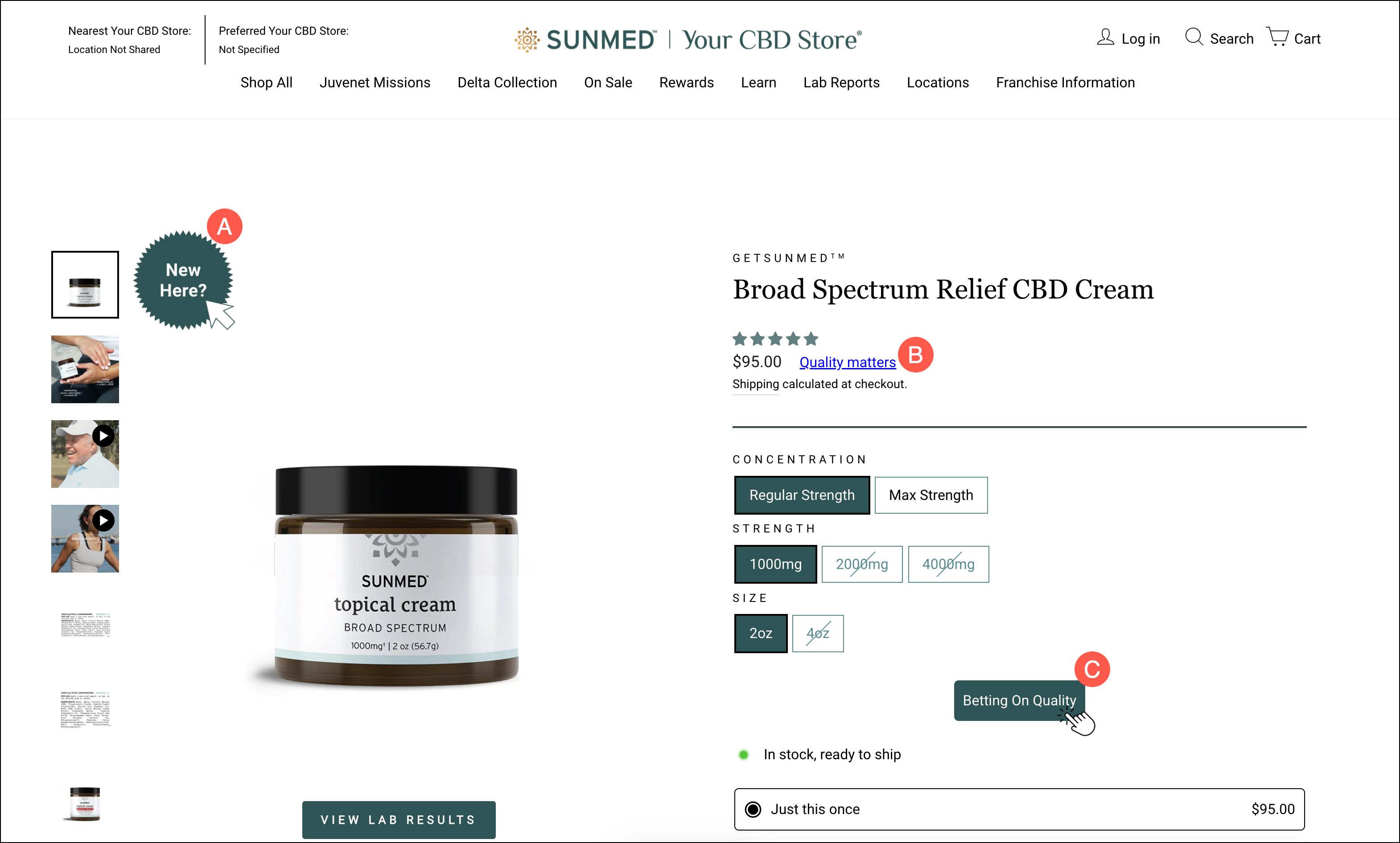
Those are just the 3 locations I could fit in my screenshot. We also targeted 6 other locations across the page.
Why so many locations? Because we knew that shoppers would likely miss many.
When any of the CTAs is clicked, we show this:

This pop-up is trying to do what a salesperson would do, which is to understand the context of the shopper. My pitch changes based on whether the buyer is experienced or new to the category. So that’s why we’re showing these 2 buttons:
{I’M RELATIVELY NEW TO IT} {I’M PRETTY EXPERIENCED}
When the shopper picks {I’M RELATIVELY NEW TO IT}, we show this screen with a little intro of the business:
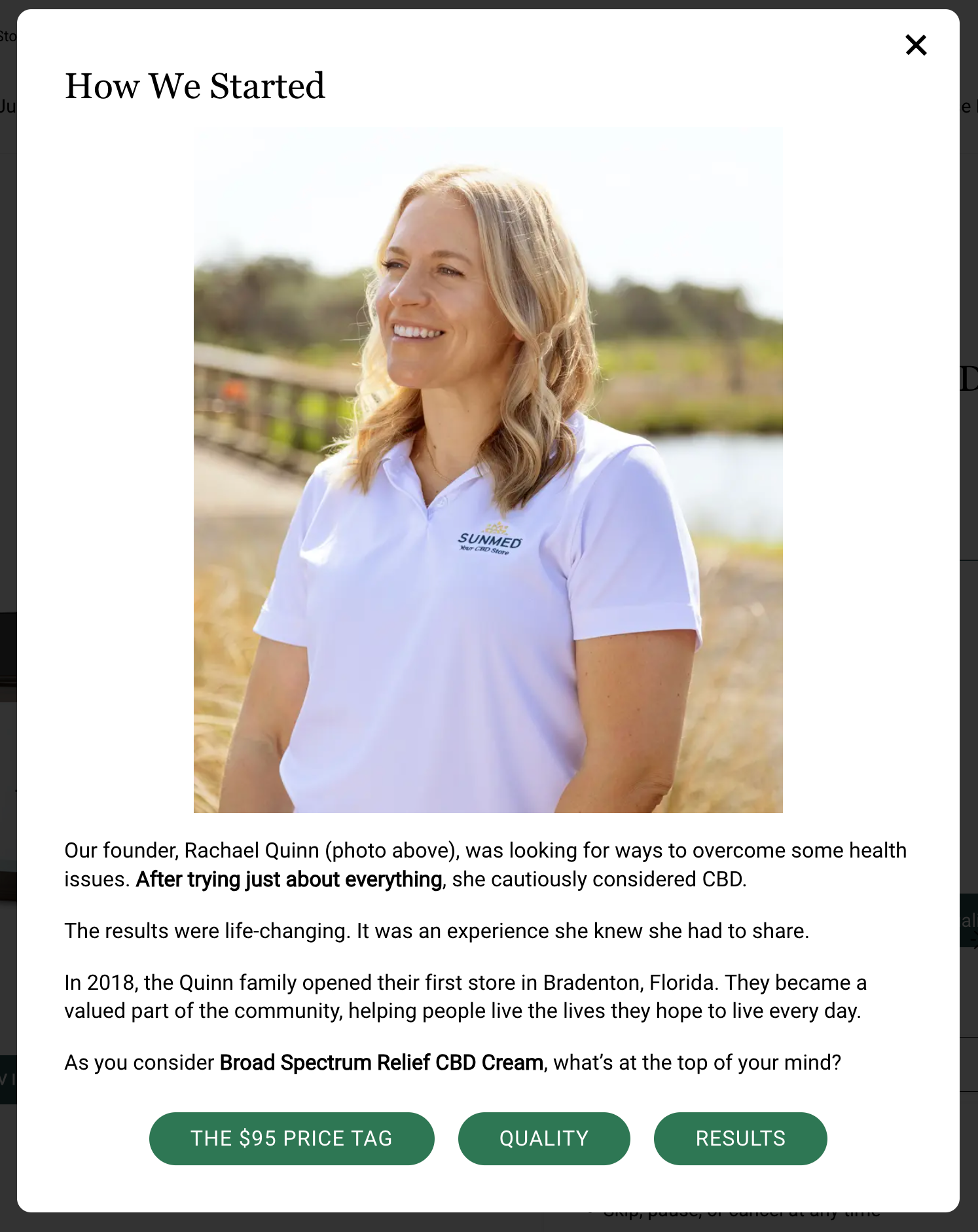
In the screenshot above, you’ll see we’re using the product name (Broad Spectrum Relief CBD Cream) in the lightbox description. This automatically changes based on which product page the lightbox is activated on. This makes the text feel more personalized.
After that brief company intro, we ask the shopper what’s top of their mind:
{THE $95 PRICE TAG} (Note: Here, $95 is dynamic and changes based on which product page you’re on.)
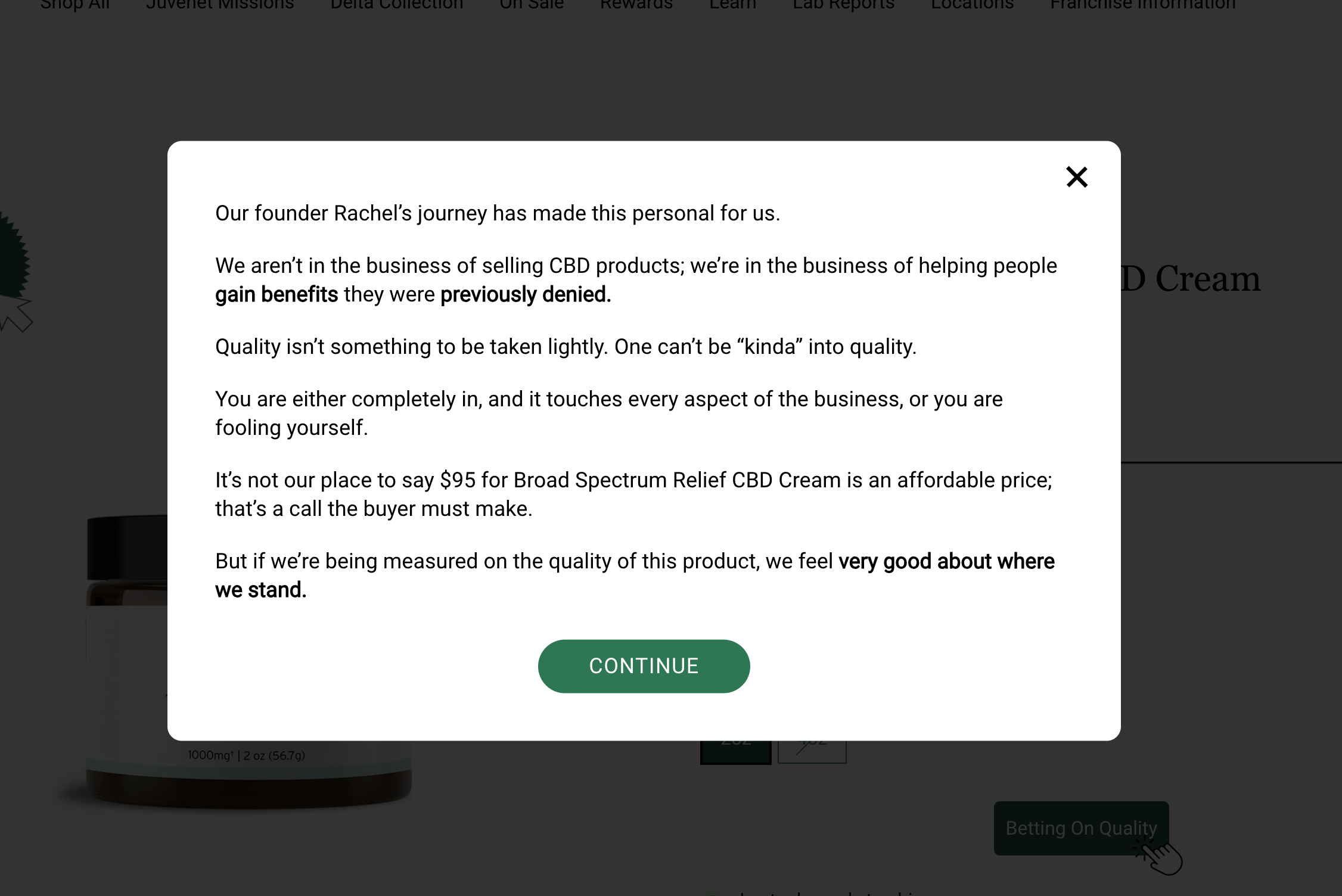
{QUALITY}
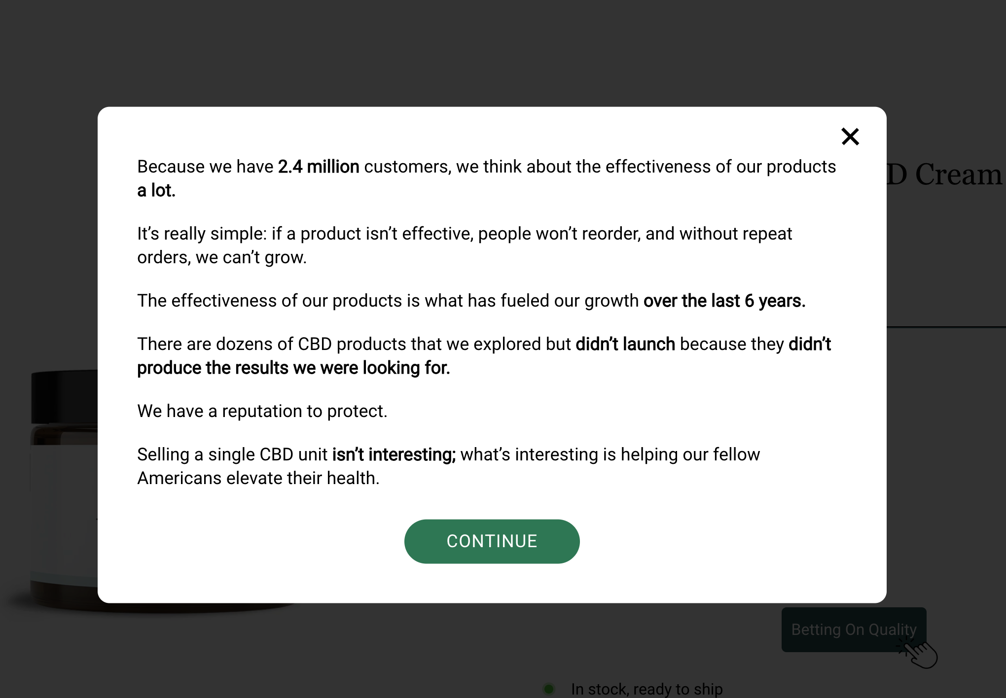
{RESULTS}
When {THE $95 PRICE TAG} is clicked, we show this:

When {QUALITY} is clicked, we show this:
When {RESULTS} is clicked, we show this:
You’ll remember that in the first screen we asked:
If the shopper clicks {I’M PRETTY EXPERIENCED}, we show this content:

This lightbox has 3 options:
{THE $95 PRICE TAG}
{QUALITY}
{RESULTS}
These are the same options from the other path, so if someone clicks these 3 buttons, we show the same content I showed you above.
RESULT
There was a 15.92% conversion (and corresponding sales impact) directly attributed to people who interacted with our test concept.
Additionally, we looked at the test data in the client’s GA4 to ensure that the A/B testing tool results mirrored what was happening in GA4. It did.
NEXT STEPS
Is this sales pitch perfect? Hardly, which is why our next test will be run on top of this winner.
Watch this space for follow-up news.
More Evidence
%
Tiege.com was already doing really well. They wanted to see how much further test to paid search landing page could be pushed.
Read Case Study%
What's better than a sales pitch that converts? A personalized sales pitch that converts.
Read Case Study%
Stix is on a mission to disrupt the golfing game. Consumers don't just buy a new golf club. A lot goes into that purchase.
Read Case Study%
Glemnetic.com is a leader in its space. We wanted to see if we could push conversion rates higher.
Read Case StudyARE YOU OUR NEWEST CASE STUDY?
We are laser focused on the type of client that our methodology and skills will give the highest return on investment and so if you meet our criteria for taking on new projects, we are confident you will see results like these.


