Case Studies
Conversion Copywriting: Close the Sale in Under Three Minutes
- Goal:
- Improve the conversion rates on their bestseller’s product page.
- Outcome:
- 10.7% increase in the conversion rate.
Note: this test is extra special to us. Typically agencies make testing look easy. They lie. This test was a beast. The first 15 iterations of this idea flopped. But we didn’t give up. Each failure forced us back to the drawing board. Then we met attempt number 16.
The Setup
Back pain is something that affects millions of people. Naturally, there are a lot of products out there designed to address this problem.
NeuroMD is one of those products. But where those other products failed, NeuroMD found great success.
Our job was to convince shoppers—many of whom have likely tried a few of those other products without positive results (otherwise they wouldn’t be here)—that NeuroMD is a must try.
Video
Did the video help explain the concept? /
The Problem
There are countless back pain products out there, from prescription medications to back rollers to TENS machines and so much more. And that is where our problem was: how could we effectively communicate to shoppers that this time things will be different? That this device will succeed where those others came up short?
The good news is that NeuroMD’s Corrective Therapy Device® does something fundamentally different than all those other products: instead of simply masking the pain to provide temporary pain relief, NeuroMD addresses the source of the pain.
All we had to do now was ensure 2 things: 1) ensure current conversions were not disturbed in any way (the client would kill us if that happened) and 2) construct a pitch for people who were close to buying but needed a little more convincing. We call this group Healthy Skeptics.
Is the idea of Healthy Skeptics clear? /
Qualities of a Healthy Skeptic
There are 4:
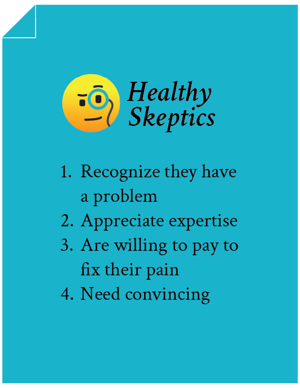
Now that we’ve got that out of the way let’s look at how the page looked before we started and then get into all the strategic buyer psychology improvements that led to a 10.7% conversion rate bump.
Control
Here is a screenshot of what the mobile page looked like before we got started.
Test Concept
There are 2 key elements to our test concept:
A:
From looking at countless heatmaps and scroll maps that show a significant dropoff in activity lower on product pages, we know that we really only have the top half of any product page to draw a shopper in and keep them glued to the page.
For NeuroMD, we took that idea to the extreme and added some copy to the very top of the page, knowing that every shopper would at least see this part of our pitch:
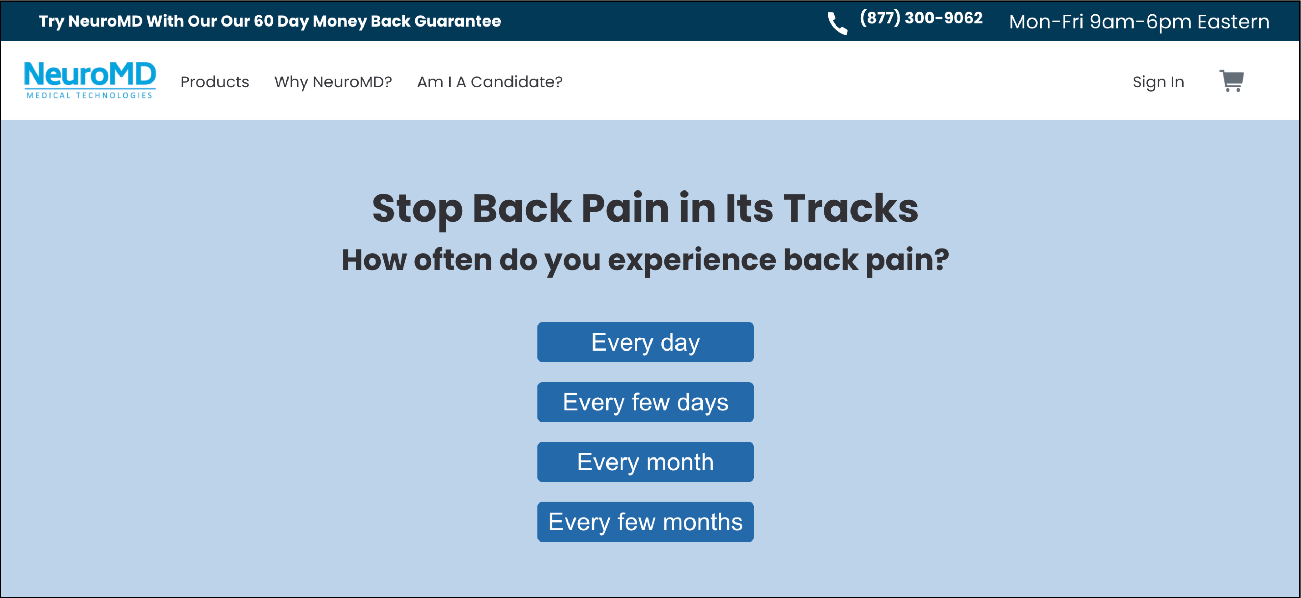
Before seeing an image gallery, a price, or anything else, this is what the shopper sees when they land on the page. We’re asking them a simple question, one that relates exactly to why they’re here in the first place: How often do you experience back pain?
Below that, we’ve added some options (knowing full well that almost everyone would click one of the first two buttons).
Our hope was to get at least 10% of shoppers to interact with this section. Once the test concluded, we saw that 17% of shoppers interacted with it.
Here’s what’s shown after a selection is made (click for zoomed view):
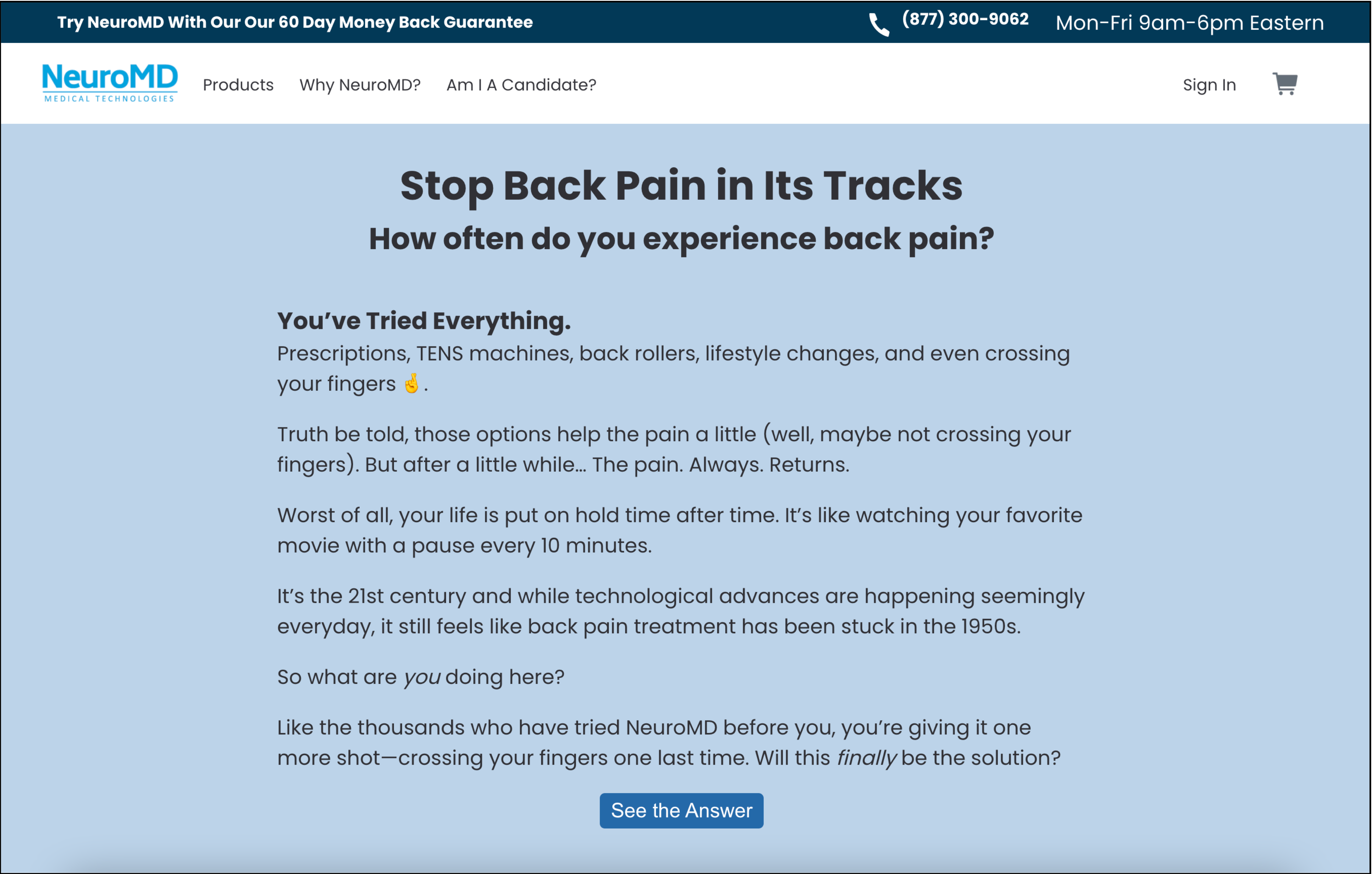
If you want to see the zoomed view, click the image above.
With this copy, we’re showing the shopper that we understand their experience of trying countless products without any positive results. We then add a little teaser by asking “Will [NeuroMD] finally be the solution?”
We’re not answering the question right there. Instead, the goal is to add a cliffhanger, pique the shopper’s interest, and make them want to learn more.
This brings us to the second key element of our pitch (and the star of this whole concept)…
B:
For Healthy Skeptics who wanted to dig deeper, we created a long-form sales pitch that is only accessible to those who choose to see it.
Did you notice the “See the Answer” button in the last image? We have similar buttons and links sprinkled conditionally throughout the page in strategic locations, locations where we believe the shopper will be most skeptical and want to learn more.
For example:
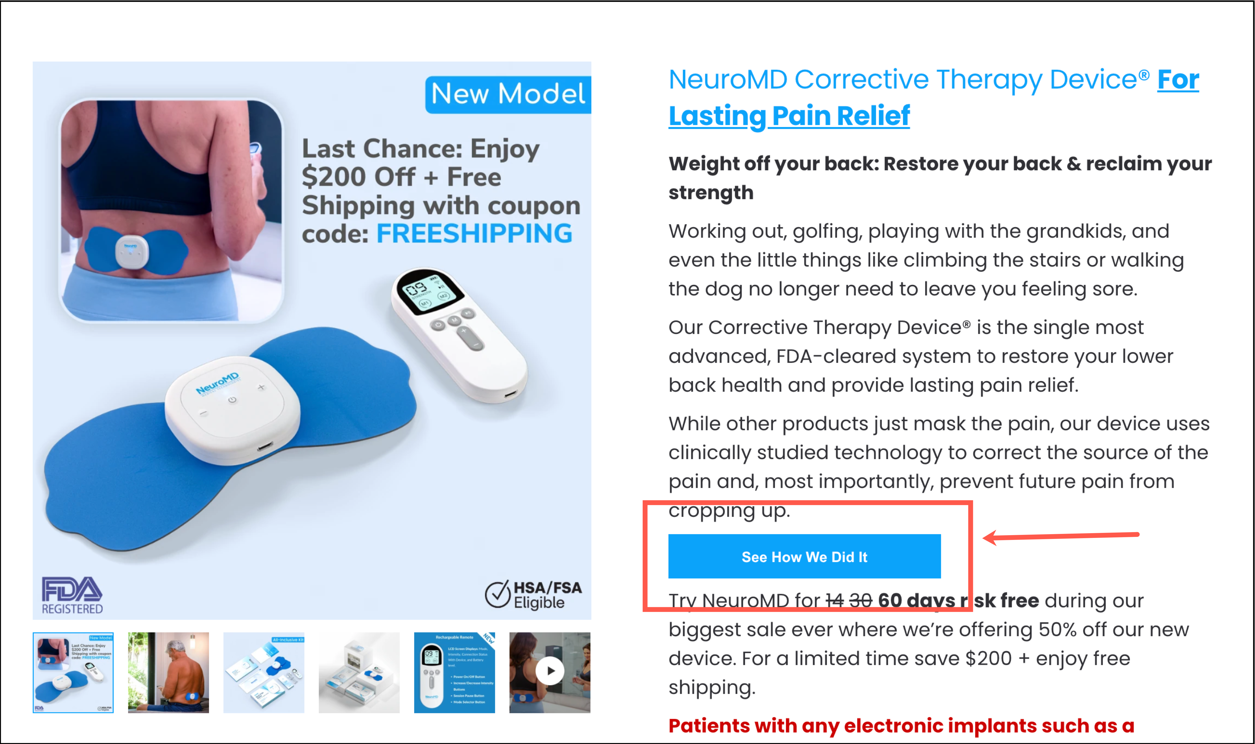
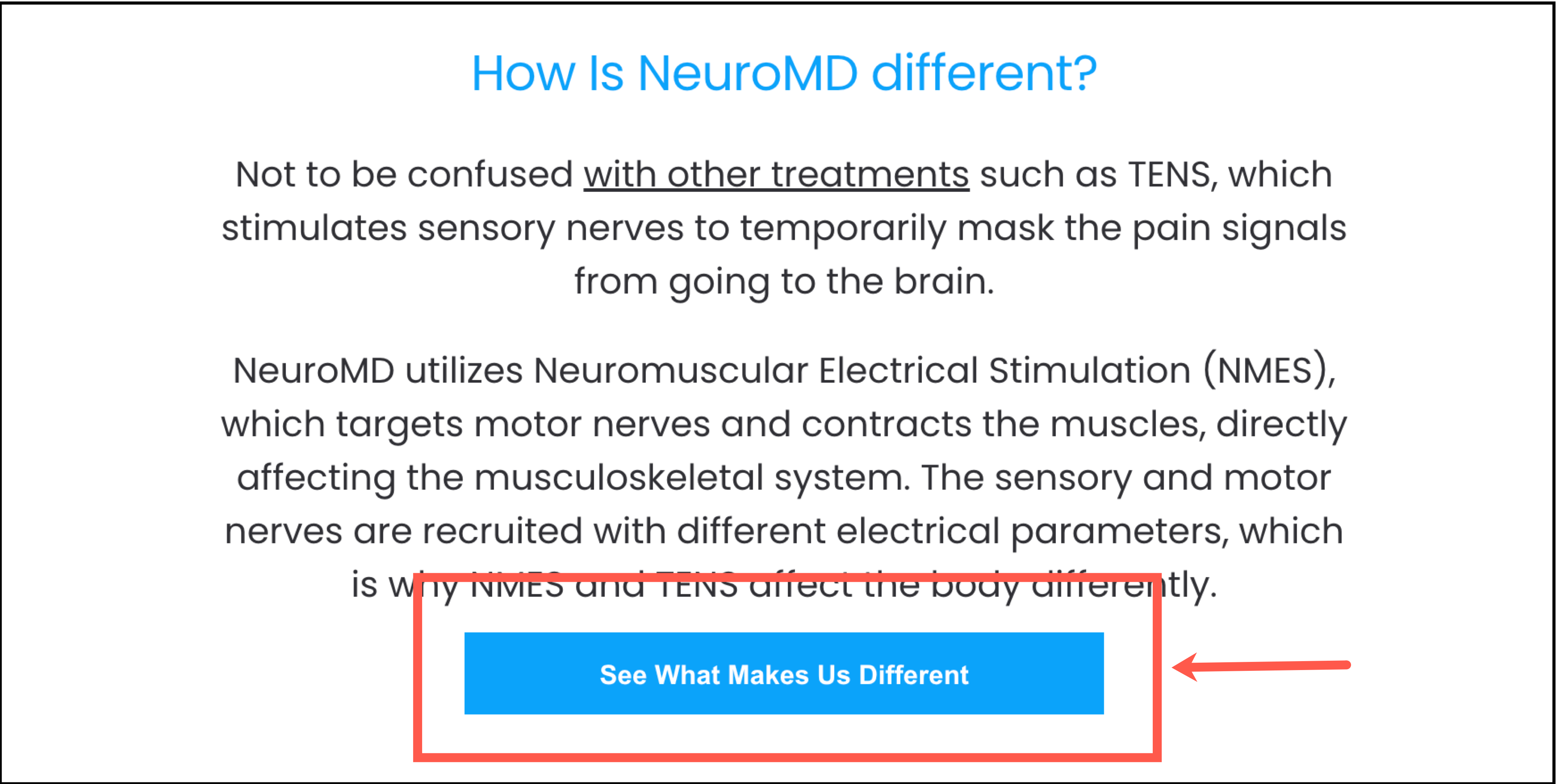

When the shopper clicks on any of these buttons or links, we hide the other buttons and links (to prevent the shopper from seeing the same content twice) and show them our long-form sales pitch in a lightbox modal.
I know some of you prefer reading and others like video content. Below you can find a video walkthrough of our long-form sales pitch and a written walkthrough.
Video Explanation of Sales Copy
Written Explanation of Sales Copy
For the first read, I recommend ignoring the annotations (numbers) I added. Reading the whole pitch will give you the full experience. After reading the whole pitch you can read the annotation explanations below.

1: Relating to the experience of the visitor. They want to know that we understand their pain and their struggle. If we didn’t, then how could we possibly provide them with an effective solution?
2: Acknowledging the competing products the visitor may have tried in the past. We’re indicating to the visitor that we’ve likely addressed the problem with those other products (otherwise, why would we create this device to begin with?).
3: Introducing the main problem with those competing products and answering the shopper’s question of “why haven’t those other products worked?”
4: Expressing the same point above through an analogy. Analogies are a great way to visually communicate a point, and visuals stick.
5: Introducing the origin story. People love origin stories (just look at Hollywood these days…).
6: Dramatizing the impact of this technology. It was so effective that even we didn’t believe it at first.
7: But then we did all the testing necessary to confirm its effectiveness and optimize it for home use.
8: This is the detail that those competing products either missed or didn’t care about. This fact is also important to mention because it means that 97% of the shoppers coming to this page will likely find NeuroMD’s device useful for their needs.
9: Emphasizing the difference between NeuroMD and competitors again. This is the major difference, which is why extra weight has been given to this detail.
10: NeuroMD is a pioneer. They’re the first to do this, which means they’re likely the best having already gone through the obstacles that any newcomers might be dealing with right now.
11: We call this a “seed of curiosity.” We’re hinting at what’s to come in the rest of the pitch. If that interests the reader, then they’ll now feel encouraged to read on. More time on the page = higher chance of converting.
12: Again placing emphasis on this point.
13: Explaining how it actually achieves the claim we’re making.
14: Continuing that explanation.
15: This “Reveal” button has been strategically placed here to interrupt the visitor’s flow. By this point, maybe they’re reading on autopilot. This button will stand out, and we want the user to stop to interact with it. On click, we show important information that we don’t want the visitor to miss: Additionally, with improved lower back health, you will experience lasting relief from back pain, leg pain/sciatica, hip pain/SI joint pain, and muscle spasms.
16: Relating to the visitor’s experience of having their back pain dictate their schedule. Had a golf trip planned but back pain got in the way? That no longer needs to be a worry.
17: Explaining to the visitor that life will be simpler and more worry-free after using NeuroMD.
18: Highlighting the practical benefits of using NeuroMD’s device. Shoppers want more than just the scientific info. They want to know that this will have a tangible impact on their lives.
19: We want shoppers to feel that this is a high-quality product (because it is!). By communicating how difficult this was to accomplish, they’ll understand that a lot of work went into engineering this device.
20: In this section, we explain each feature in simple terms so the shopper understands the importance of that feature and how it will have a positive impact.
21: Since we already have the shopper’s full attention if they’ve made it this far into the pitch, we want to take this moment to highlight important details (like guarantees, a sale, buying options, etc.) that they might have missed elsewhere on the product page.
22: So many marketers are making shoppers feel forced to buy right away. Things shouldn’t have to be this way. The pitch and product should do the talking. We’re showing shoppers that we recognize that in this section by not pressuring them to act today.
23: Taking the above point a step further by recognizing that the shopper has a big decision to make (this is more effective with pricier products like this one).
24: We’ll still be here after they’ve decided. This whole section (#22–24) creates a more likable personality. That can go a long way when a shopper is debating between you and your competitor.
CLIENT TESTIMONIAL
I love how Rishi and his team never give up, are very creative, and come up with unique angles and ideas. I feel like they are part of our team and look forward to working together on many future projects!

Anthony Rumbello
Founder
GetNeuroMD
Outcome
The test was exposed to 22,914 visitors and recorded 883 orders when the statistical winner was declared. 10.66% lift.

More Evidence
%

Tiege.com was already doing really well. They wanted to see how much further test to paid search landing page could be pushed.
Read Case Study%

What's better than a sales pitch that converts? A personalized sales pitch that converts.
Read Case Study%

Stix is on a mission to disrupt the golfing game. Consumers don't just buy a new golf club. A lot goes into that purchase.
Read Case Study%

Glemnetic.com is a leader in its space. We wanted to see if we could push conversion rates higher.
Read Case StudyARE YOU OUR NEWEST CASE STUDY?
We are laser focused on the type of client that our methodology and skills will give the highest return on investment and so if you meet our criteria for taking on new projects, we are confident you will see results like these.


