Case Studies
Personalized Copy Increased Sales by 8.97% for a Best Seller
- Goal:
- One of the best-sellers on HandicappedPets.com is their Walkin’ Wheels SMALL Dog Wheelchair. Our goal was to improve this product page’s conversion rate by optimizing the copy.
- Solution:
- Our idea was to personalize the copy by asking users what the name of their dog is. We then added their dog’s name in various locations in the copy to get the user to picture their dog using the product and benefitting from the product.
- Outcome:
- 8.97% lift in conversion rate and 9.06% lift in revenue.
Backstory
We have been working with HandicappedPets.com for a while, and we still can’t talk about their amazing products enough. Our pets are family, so they deserve proper medical attention just like anyone else in our lives — and that’s what HandicappedPets.com provides with their Walkin’ Wheels SMALL Dog Wheelchair. But the product page didn’t contain a lot of copy that connected with the shopper emotionally. That’s where we come in.
Our Hypothesis
By asking the user for their dog’s name and adding that name throughout our copy, we can encourage the user to imagine their dog using the Walkin’ Wheels SMALL Dog Wheelchair and benefiting from it. In turn, this should increase the likelihood that they order from HandicappedPets.com
Test Concept
We did 2 things in our concept:
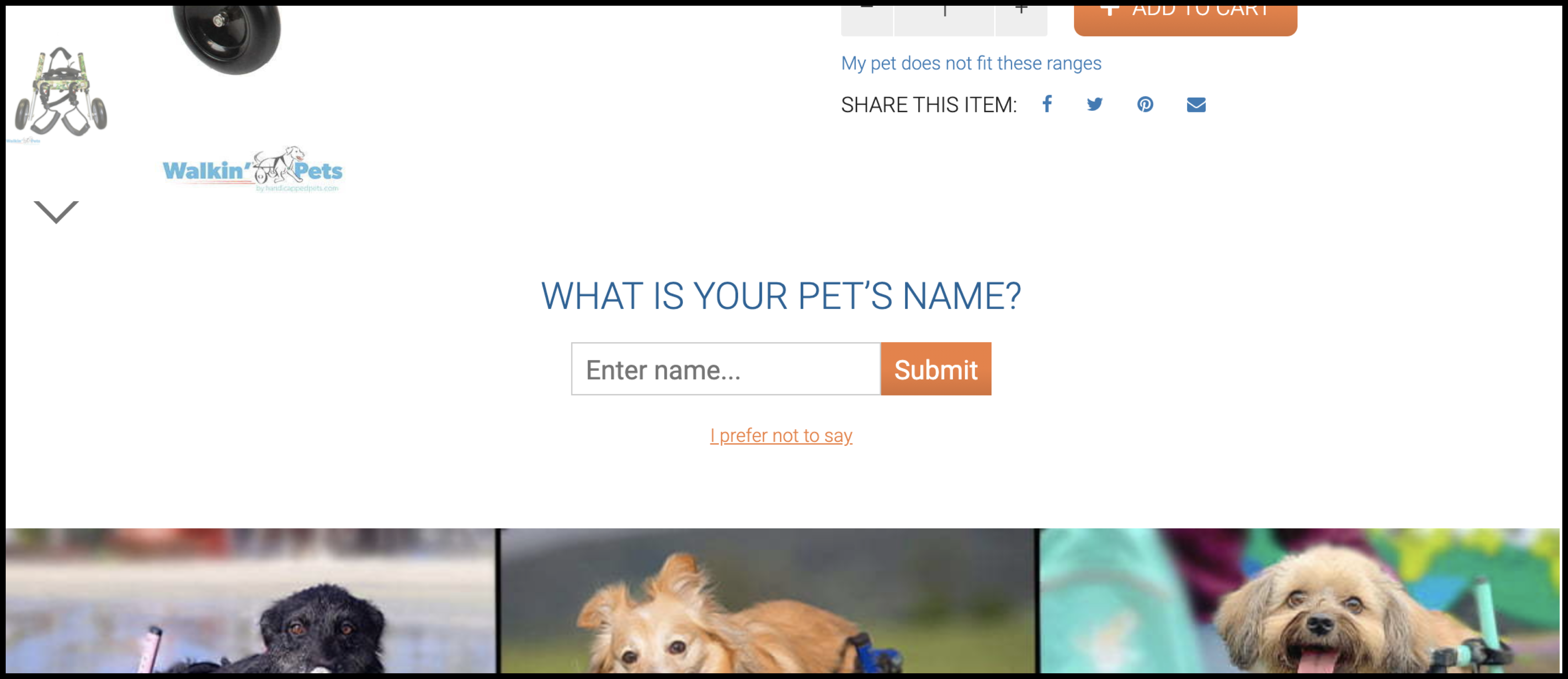
1. We added the section shown below that asks users to enter their dog’s name (and since we don’t mention to the user what happens after entering a name and since people are naturally curious, we expected people to be drawn in by this and enter their dog’s name):

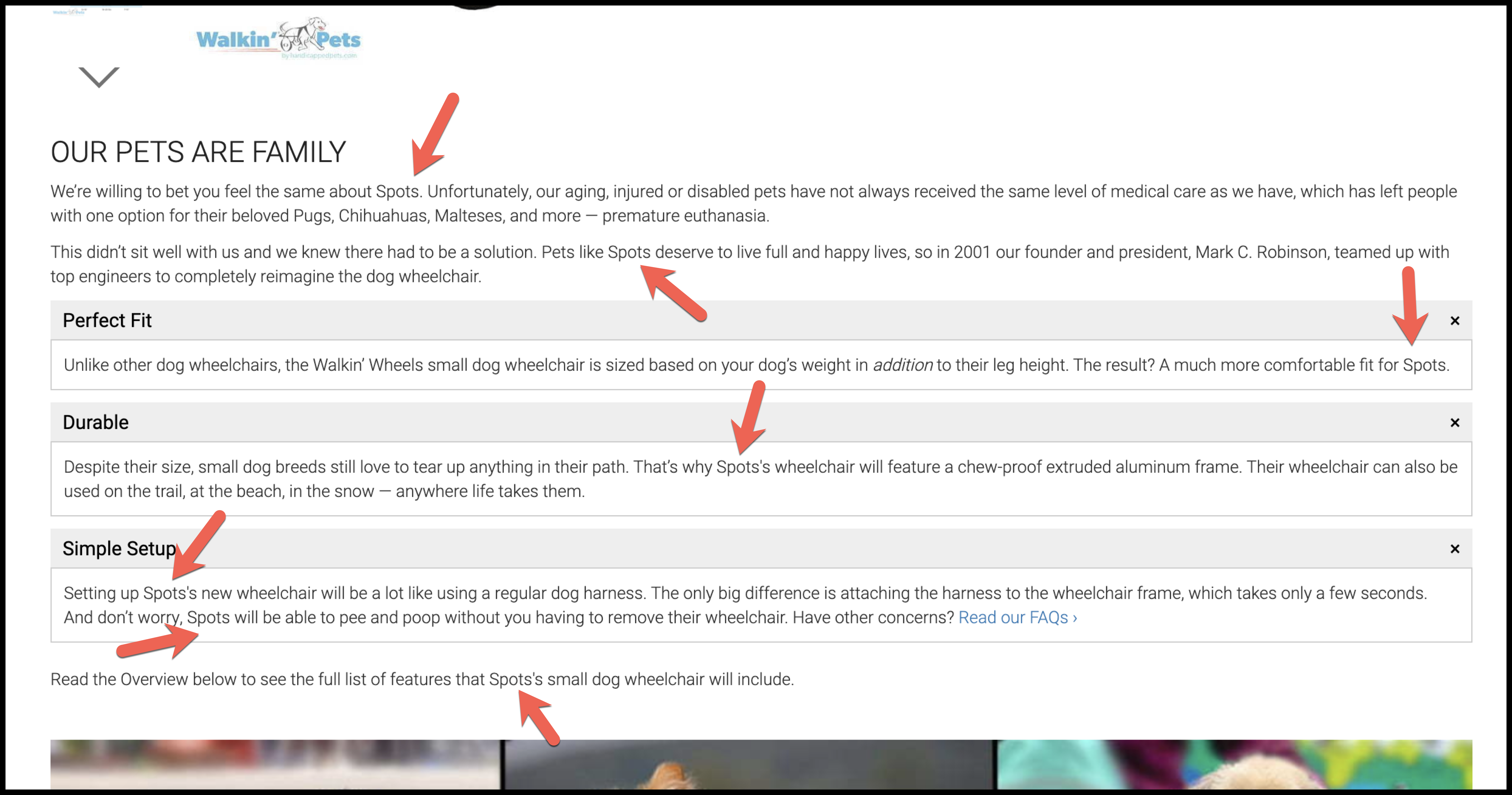
2. After users enter their dog’s name, they see this copy (each arrow represents a location where we inserted the name of the user’s dog):

Note: The accordion menu has been completely opened to show you all of the copy in one image.
Outcome
We ran this as an A/B test, and our variation was declared a winner. Our variation saw an 8.97% improvement in conversions and a 9.06% improvement in revenue:

Why Our Concept Won
Before our concept, there was a good chance users weren’t actively thinking about their dogs or imagining them with the product. Instead, they were thinking about things like price, shipping, return policy, etc.
We believe our concept won because by using the name of the user’s dog, we are forcing the user to think about their dog, the pain or sadness their dog might be experiencing, and how their dog is a family member who deserves to walk, run, and play again.
More Evidence
%

Tiege.com was already doing really well. They wanted to see how much further test to paid search landing page could be pushed.
Read Case Study%

What's better than a sales pitch that converts? A personalized sales pitch that converts.
Read Case Study%

Stix is on a mission to disrupt the golfing game. Consumers don't just buy a new golf club. A lot goes into that purchase.
Read Case Study%

Glemnetic.com is a leader in its space. We wanted to see if we could push conversion rates higher.
Read Case StudyARE YOU OUR NEWEST CASE STUDY?
We are laser focused on the type of client that our methodology and skills will give the highest return on investment and so if you meet our criteria for taking on new projects, we are confident you will see results like these.


