
Case Studies
How Assurance Messaging Increased Revenue 6.72%
- Goal:
- Increase revenue by at least 5.85% on the cart page.
- Solution:
- Craft original copy that informs the shopper about what makes True Leaf Market special in the industry to instill trust in the shopper and the confidence to complete their order.
- Outcome:
- Increase in completed orders and revenue generated on the cart page.
True Leaf Market is one of the top online stores for seeds. They’ve worked diligently over the past couple of decades to streamline the seed shipping process, and their customers are always surprised to see how quickly their seeds arrive. True Leaf Market’s focus on making life easier for their customers was something we felt needed to be included on their cart page.
Backstory
The cart page is a double-edged sword. On one hand, it’s the page that has the highest purchase intent (before the checkout pages). On the other hand, it’s a page that we’re always battling with to lower the drop-off rate.
This was the same battle we walked into with True Leaf Market. How could we encourage more shoppers to click ‘Checkout’ while on the cart page and complete their order? Was there something missing from the pitch True Leaf Market made on the rest of the site that could give shoppers the confidence to move forward on the cart page?
Our Hypothesis
True Leaf Market is unique in its industry. They’re able to ship seeds, even in large quantities, much quicker than other online seed stores. And they haven’t had to sacrifice quality to do so.
We felt that everyone on the cart page needed to understand this information. Our hypothesis was that if we could educate the shopper on True Leaf Market just one more time before the checkout pages, we could drive more shoppers to click ‘Checkout’ and complete their orders.
Test Concept
To test our hypothesis, we created a concept that included two sections of the original copy. We also made some other minor changes throughout the page, but our primary focus was this copy. This will be our primary focus for this case study.
Variation 1
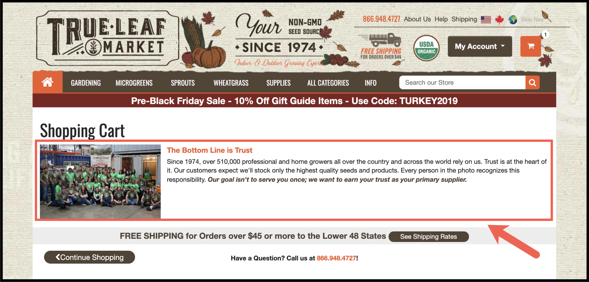
For our test variation, we first added original copy and a team photo under the “Shopping Cart” page heading:
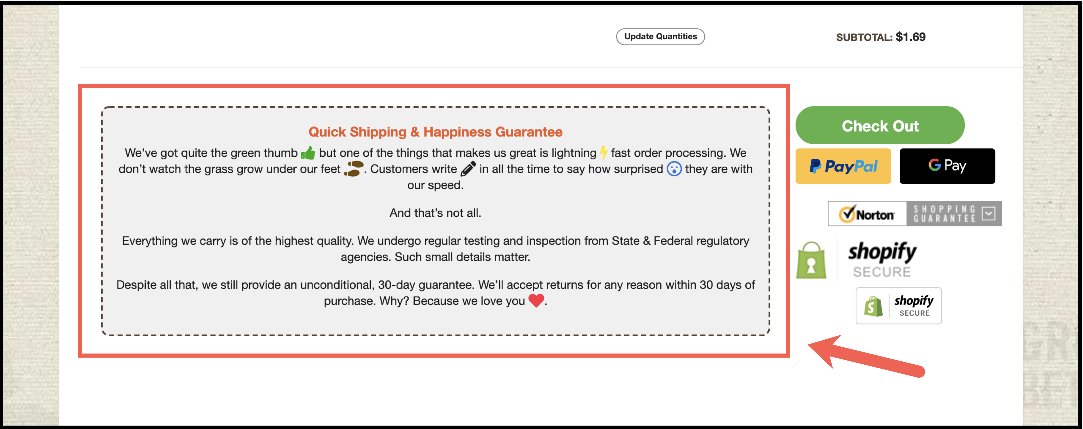
We then removed the following icons from the Control:
And replaced those icons with original copy:
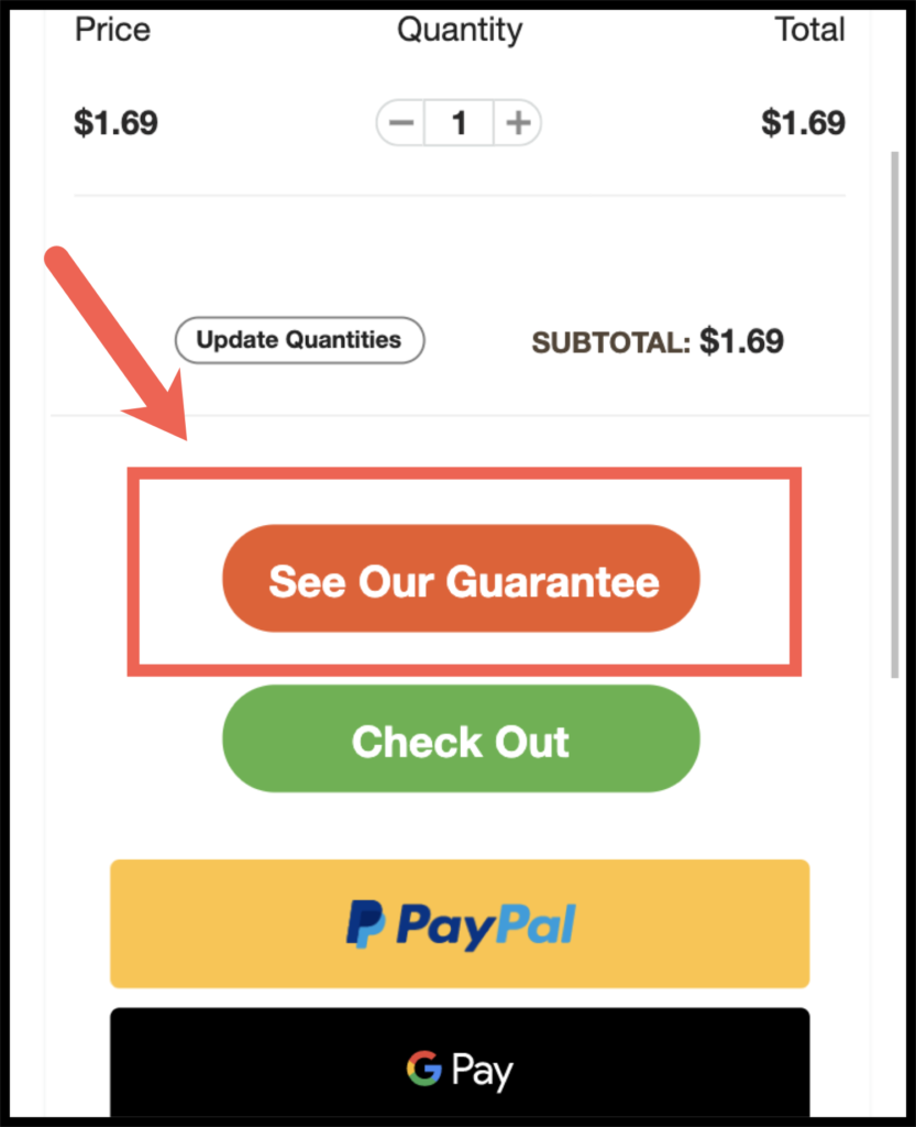
For mobile users, we hid this second section of copy behind a call to action:
Outcome
For this A/B test, we targeted mobile and desktop traffic. As with all our A/B tests, we used Visual Website Optimizer (VWO) to split our traffic and track our data.
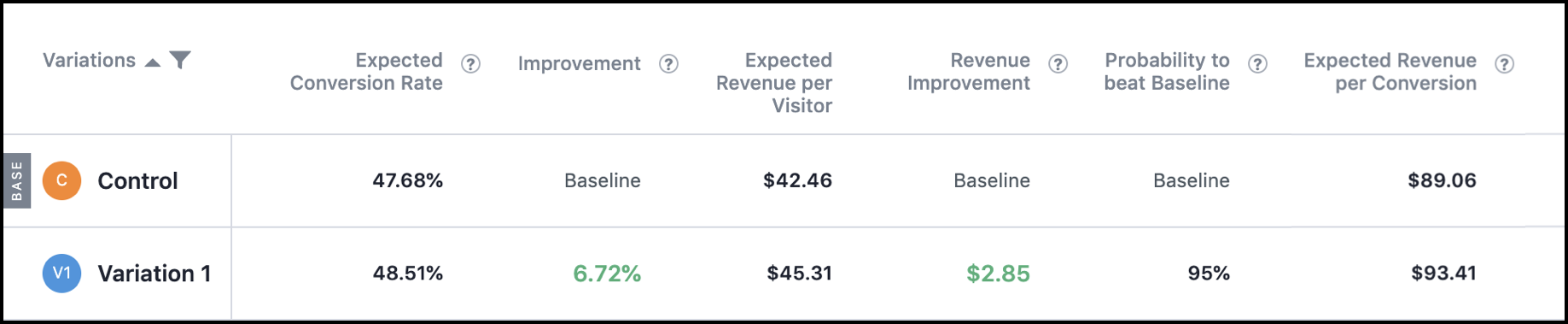
Our primary goal for this test was reaching at least a 5.85% lift in revenue with at least 95% confidence.
After 6 weeks, we were able to reach and exceed our primary goal of a 5.85% lift in revenue. Variation 1 resulted in a 6.72% lift in revenue on the cart page with 95% confidence:
Why Our Concept Won
Our concept increased the visibility of multiple points of assurance that were located elsewhere on the site in low-visibility areas (the Return/Refund Policy, Our Story, and Shipping pages — all typically found in a page footer). We strategically placed these points of assurance on the cart page because, believe it or not (although the data speaks for itself), details such as how long the company has been in business, how many customers they’ve served, how quickly they ship, and the guarantees they give can provide shoppers with the confidence needed to make a purchase.
More Evidence
%
Tiege.com was already doing really well. They wanted to see how much further test to paid search landing page could be pushed.
Read Case Study%
Stix is on a mission to disrupt the golfing game. Consumers don't just buy a new golf club. A lot goes into that purchase.
Read Case Study%
Glemnetic.com is a leader in its space. We wanted to see if we could push conversion rates higher.
Read Case Study%
This client's viral video was driving a ton of traffic to their bestseller page. Our job was to convert that traffic...
Read Case StudyARE YOU OUR NEWEST CASE STUDY?
We are laser focused on the type of client that our methodology and skills will give the highest return on investment and so if you meet our criteria for taking on new projects, we are confident you will see results like these.


